 Our Inside Look feature at Broken Frontier provides creators with the opportunity to share exclusive commentaries on their comics projects with our readers, giving insights into the genesis, process and themes of their work.
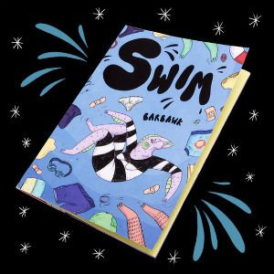
Today, as part of our 2019 Broken Frontier ‘Six Small Press Creators to Watch‘ programme of coverage Abs Bailey, aka Barbawk, talks to us about her anthropomorphic animals/slice-of-life short comic Swim, reviewed here last year at BF…
Setting
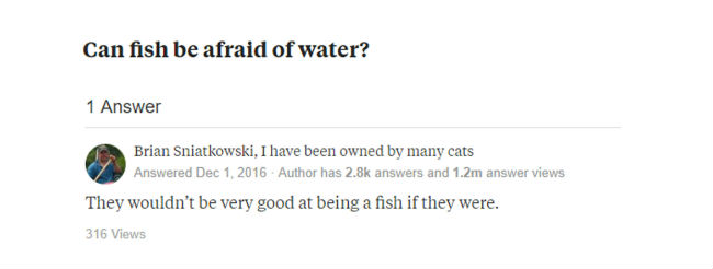
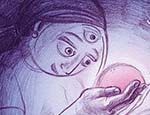
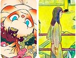
A lot of people ask if Swim came from some deep emotional revelation. Whilst it did end up exploring some pretty weird emotions, the inspiration originally came from a 3am Skype call with a friend. We’d googled if a fish could be scared of water and came across this gem (above) on Yahoo answers. The idea sort of spawned there, and sat tucked away in my head for a year until I had to think of a comic idea for my final major project at uni.
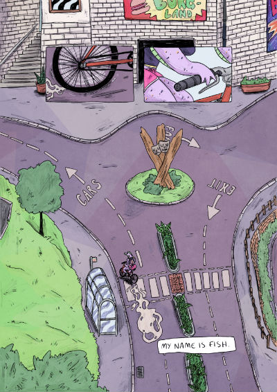
I’d spent my summer doing quite a lot of swimming, particularly at two local pools watching the same friend doing their scuba diving training. The ‘afraid fish’ idea seemed to flow perfectly into how disgusting and creepy one of these pools was. It was like a relic from the 1960s, and inspired the setting for the interior of the pool in Swim. The exterior setting (above) was based on another pool, somewhere I’d spent most of my teen years hanging out and doing some questionable things. The unsettling nostalgia I felt in these places really helped me set the tone of anxious unease that Fish experiences throughout the comic.
Pools are gross
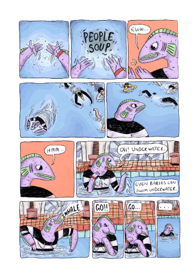
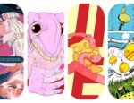
I find swimming pools really gross (and as a consequence I’m a really bad swimmer). This became a huge part of Fish’s anxieties in her story. I wanted to make the pool seem as disgusting as possible, and throughout the comic you’ll see plasters, hairs, and feet all over the place. I had this vision of all the dirt in the pool coming together like an alphabet spaghetti that spelled ‘people soup’, referring to something Fish had called the pool when she was explaining why she didn’t like them. Another important element of the story was Fish feeling a bit stupid and inadequate because she was a fish that couldn’t swim. I really like how the last five panels came out- I was trying to show how having fears about doing something can just make you not be able to do it, even if it’s meant to be easy. I have the same thing about swallowing tablets, even saying “3..2..1..go!” to myself over and over whilst I don’t actually do anything. I usually angry-laugh at myself whilst this happens and I really wanted to put that frustratingly funny feeling across into Fish trying to go underwater for the first time.
The mouth
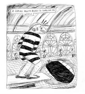
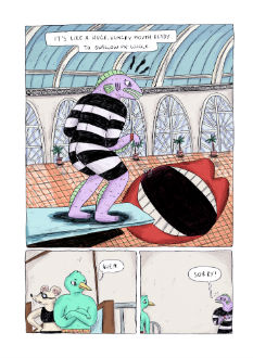
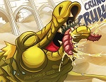
When I make comics I’m a living nightmare for anyone else involved in the process other than myself. As this was a uni project, we got checked up on every few weeks; I’ve never felt as bad for anyone as when I arrived with a folder of post-it sized scraps of paper, and dumped them over the table in front of the lecturers. It is really useful though, in that it was a great way to take little snippets of ideas for the Swim universe, and re-order and play around with them until I had something that worked. These scraps were drawn in biro and pencil, and I ended up liking them so much I did the final artwork in the same materials too. The large panel above was one of the first ‘scraps’ I made, and it stayed pretty much the same. I was inspired by surrealist editorial illustrations for this part, but I also wanted to showcase the beautiful (if grotty) high arched windows and ceilings I’d been inspired by at the pool the comic was based on. It ended up wrapping up nicely into an image that inspired the look for the rest of the comic.
Bringing Fish to life
As soon as I’d started writing this comic, I knew I wanted to incorporate something 3D into it. I was inspired by shows like The Mighty Boosh that use obviously hand-made practical effects, and those parts in Spongebob Squarepants where it ‘zooms in’ and something is painted in really disgusting detail.
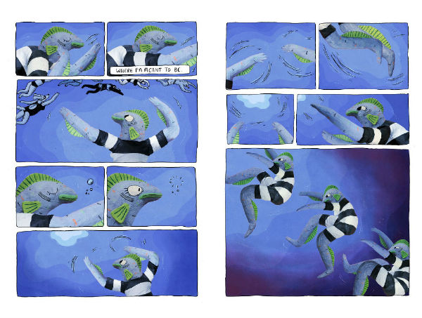
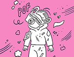
Originally, Fish was going to be a poseable muppet-like puppet, with rods to pose her. However, I went into making her without planning anything, and after three days, a LOT of tin foil, and two old shirts, I had a totally rigid and unmoveable doll. Plan B was to take a ton of photos (I think it ended up being about 600) from different angles, and photoshop elements taken from these together to have a fully posed figure. I only used this when Fish is underwater, to try and represent that strange, submerged feeling where only what’s directly in front of you seems real and everything above the water is almost in another world. The Fish doll is also a little uncanny, and I think it worked pretty nicely to make the panel where she begins to drown more visually uncomfortable than it would if it were drawn.
Vending machine
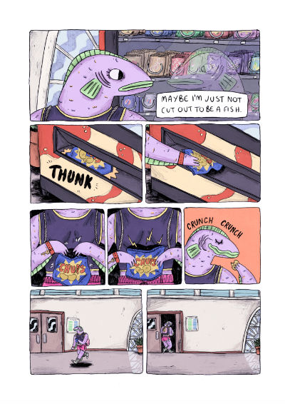
After Fish is rejected from her near-death experience in the pool, she leaves and experiences something we all do; that after-swim hunger that can only be fixed with crisps. I wanted to put this in, but also needed to lean towards the self-reflective ending where Fish chooses to accept that this time was a failure, but it didn’t mean that she couldn’t try again in the future. I thought it would be funny to let Fish have her literal ‘self-reflection’ moment in the vending machine glass, and it ended up working perfectly for the shift in tones that happens at the end of the book. When she is looking in the glass, Fish is feeling defeated and upset, even going as far as to question is she’s really a fish at all. The action of the crisps falling out of the machine and interrupting her thoughts allows the attitude to naturally shift to something more positive as she leaves the pool. We all know that eating after swimming gets rid of that horrible sick feeling you sometimes get, and it does the same here, just for Fish’s emotions. Crisps can fix anything. That’s solid life advice right there.
For more on the work of Abs Bailey you can visit her site here, her online store here and also follow her on Twitter and Instagram.


