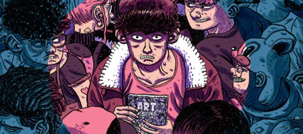
Inside Look is Broken Frontier’s director’s commentary-like feature in which creators take you behind the scenes of one of their latest comics to hit the stands. In this edition, Jamie Coe discusses the process of getting his debut graphic novel, Art Schooled, published by Nobrow and shares some of his personal highlights of the story.
by Jamie Coe
Daniel Stope is a small-town guy who dreams of becoming an artist. His enrollment at art school and consequent move to the city opens up a world of exciting possibilities. Unsurprisingly, Daniel struggles with his new-found independence – the difficulties of dating and making new friends in the big smoke.
Art Schooled came to fruition just after I finished university in 2012. I had been in contact with Nobrow (in particular Alex Spiro, my humble editor) whilst I was at art school, so when I finished, they asked me if I would be interested in writing and illustrating a book about art school. Originally the book was supposed to be a short story, but I wanted to flesh out a script for a full book – luckily they liked it!
Pages 1 – 2
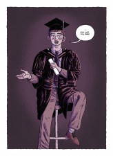
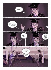
I generally like writing stories that open with an enigma – it’s a good tool to capture the reader’s attention and interest from the very start. In this case I wanted to open the book with my protagonist, Daniel Stope, as he graduates from art school. He has bruises on his face and a broken nose, but he looks happy. He says ‘I wish I was still there’; I wanted the reader to question why he’s beat up and why he wants to still be there.
As he talks to the reader, seemingly breaking the fourth wall, it feels similar to something from a stereotypical (often cheesy) coming of age film from the 1980’s. With the last panel, I wanted to take that scene and bring it to a halt, like when the music suddenly stops at a party and you’re just left with an awkward silence.
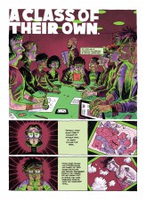
Pages 11 – 12 (‘A Class of Their Own’)
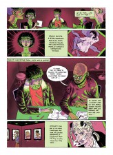
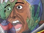
I tried to use surreal colours to bring atmosphere and emotion to some scenes to emphasize the way Daniel see’s things. For the scene ‘A Class of Their Own’ I used a blood maroon and heavy bright green under-lighting, giving it a creepy feel, like a horror B-movie.
Daniel is quite calculated and organised in his own way – the pages show mug shots of the characters and evidence of their artwork, almost as if they were serial killers and Daniel were the detective.
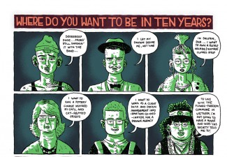
Questionnaire Half-Pages
Throughout the book there are questions asked to the same group of students including “Where do you want to be in ten years?”, “What’s the best thing about art school?”, “What’s the worst thing about art school?” and “What do you think of art school in hindsight?”
These characters are based on stereotypes that I think a lot of people who went to art school will recognize. These were really fun to do and I think they help flesh out the whole art school world and the diverse range of people there.
I graduated in 2012, so it hasn’t been long, but I find it really interesting seeing people’s evolution since they left uni. In the last of this segment – where the characters are talking about art school in hindsight, some of them have changed their opinions of art school, their interests and even their ideals.
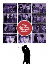
Page 27 (‘First Day of My Three Year Degree’)
Because the whole story is quite compressed (it takes place over four years) it was sometimes a challenge to give a sense of things happening in short amounts of space. I wanted to put emphasis on the scene where Daniel kisses Pip for the first time, by slowing down the reader, letting them spend more time taking in what’s happening on the page. I think people generally spend more time reading a silent comic – there’s only visuals to decipher what’s going on, and unlike the directness of words, it can take some time to analyse.
It’s a very simple series of snapshots from their first day at university, but hopefully it has a sense of progression, a building of chemistry between the two characters; you don’t know what they’re saying to each other, but at the end of the day, it almost doesn’t matter.
I used purple to colour the scene as it’s a colour strongly associated with Pip, and the silhouette kiss at the end gives you all the information you need to know, without overplaying it.
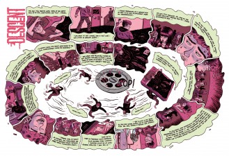
Page 56 – 57 (‘Descent’)
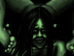
This scene takes place when everything seems to be going wrong for Daniel. It’s essentially told as an inner monologue whilst showing a montage of images – realistic or metaphors. I used a maroon-pink instead of a red because I wanted to emphasize a sense of anxiety rather than danger.
The layout idea was to make this double-page spread unsettling to read; the reader has to turn the book around slowly as the panels spiral into the centre of the book.
At the beginning of the page, Daniel is lying on his bed looking restless; as the panels spiral into the centre, he sinks through his bed as though it were thick tar, and spirals down into a drain. I wanted to create a sense of a downward emotional spiral.
For more on Art Schooled, read our interview with Jamie Coe.


