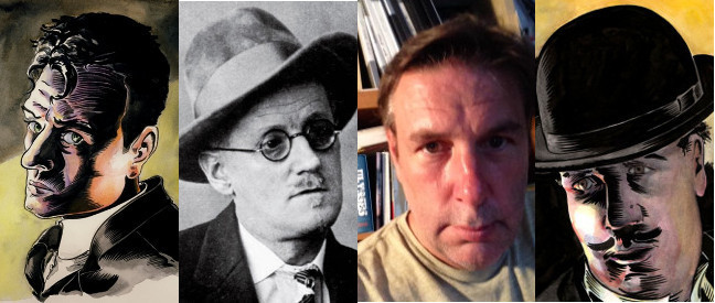
Few novels have as daunting a reputation as James Joyce’s Ulysses.
An evocation of a single day in the life of Dublin (16th June 1904), focusing on the personal odysseys of two men in particular, its ‘plot’ might sound simple enough. However, with 250,000 words in a sometimes baffling melange of styles and voices, it can be rough terrain for the reader who enters without any kind of map.
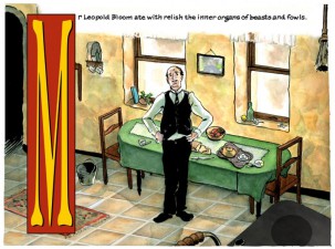
Enter Philadelphia-based artist Rob Berry, who has taken it upon himself to adapt the grand leviathan of 20th-century fiction into a graphic novel. But his Ulysses “Seen” project, now produced with the support of the James Joyce Centre in Dublin, goes far beyond that.
With the input of designers, coders and Joyce scholars, it has grown into a fully interactive iPad app, providing a readers’ guide to each page and the ability to open up discussions with other readers.
Before jetting off to Dublin for this year’s Bloomsday celebrations, Rob was kind enough to answer a few of our questions.
This is one of the most ambitious comics projects I’ve ever seen anyone take on. What the hell were you thinking?
A few years back, when I’d first meet a fellow cartoonist and they’d heard what I was doing, they’d look at me and wonder if I was kidding or plain old crazy.
It IS a crazy idea when you first hear of it. But one of the big issues people like myself were puzzling out a few years back, as comics started to gain an educational application, was how do we use comics to interpret literature without dumbing it down? And one of the big issues about digital comics at that time was what can the digital page do differently and still be comics?
Well, both of those questions fell very neatly into an idea I had for using the window of a comic page like a filing cabinet. The touch screen of the iPad offered a new way of illuminating complex stories, so that the images of the comic lead to a deeper, annotated reading experience.
Ulysses, always at the top of everyone’s “difficult books” list, seemed the best way to showcase the idea. Can you think of a more famous modern novel where new readers need as much help as they do in Ulysses?
But the real truth of the matter is that I started doing it on a bet over pints of Guinness one Bloomsday. The sometimes maddening and constantly challenging fact is that I won the bet and the job stuck with me.
What was your background in comics prior to Ulysses “Seen”?
 Very little comics work before that. I grew up reading them and hoping to draw them, but went off to art school to become a painter instead.
I enjoyed making paintings for galleries but, around 2000 or so, I started wanting to make books and prints and to deal with longer stories than the four corners of one canvas would allow. So I started looking at comics again: not just the superhero comics I grew up, with but the new landscape of independent and art comics that was now possible.
Digital was the new frontier in 2000 and really, really an exciting and energetic place for new ideas. So I turned my attention there. I did a little piece for DC’s Zuda Comics back then with some friends I met through that lab experiment but, for the most part, Ulysses has been my daily labour.
Can you give us a quick breakdown of your process in taking a section of Joyce and turning it into a comics page?
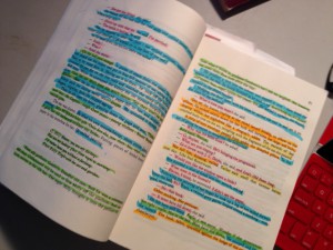 A quick breakdown? Probably not. But I am a process head (I keep a process blog on Instagram), and now that I’ve been asked to teach comics, I keep better track of this stuff than ever.
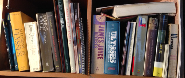
There’s a copy of Joyce’s original edition and about 20 other books on my desk. In this copy I’ve gone through and labelled all of the text with separate highlighter pens; ‘spoken aloud’, ‘internal monologue’, ‘narrative voice’, ‘descriptive passage’, etc. About seven highlighters in all.
Then I sit down with the other books and some blank white paper and try to show new readers who is saying what and how it all might look to have them say it right there. I mean, that is the secret power of comics, right? We read it and see it at the same moment. We’re there with what we read.
So this means sorting out who’s saying what – a very tricky thing when reading Joyce. But just this little thing, like the difference between a word balloon and a narrative box, can mean a much easier time for new readers. Quite a lot of work is done just getting that bit right.
But unlike a print or film adaptation, our digital page is capable of leading readers inside the text to further explanation. You can see a word balloon containing a foreign language, tap it on your iPad and get a pop-up translation without leaving the page.
This means our function is more as an educational tool than as a comic book adaptation, and much more of the original text can go in there – pretty much all of it, in fact.
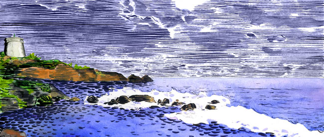
Which means a lot more drawing. I recently storyboarded one of the book’s most complex chapters, ‘Proteus’, in which a character takes a long walk on the beach and writes a poem. In the book it makes for 13 pages of some of the most intricate allusions in modern literature. To do that in comics, to show people what’s there in the text, took more than 100 pages of cartoons.
How consciously did you try to come up with a style to reflect the complexity of Joyce’s work? Have there been things you’ve been unable to capture?
This is a really interesting question. As I mentioned above, I didn’t really get serious about making comics until I was 40, and spent my time before that making paintings. Style isn’t really a question I dealt with as a painter. As a painter you just make images that interest you in a way that holds or reveals your interest in making them.
But comics is a language, and style within that language is like accent and grammar and inflection and, well, damn near everything else an actor might use to convey message or personality in service of the story.
People who draw comics are speaking that language and giving it their own inflection, so their method is in service of that purpose. It’s quite a bit different from how one might draw a portrait, a landscape or a still life. Chris Ware’s sketchbooks are the obvious great example of how drawing and storytelling are two entirely separate art forms, with separate sets of goals, methods and purposes.
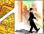
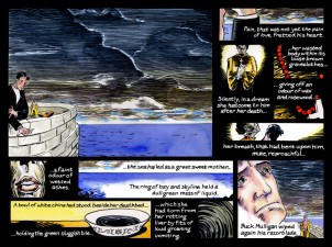 For Ulysses “Seen” I was very deliberately setting myself a style mode that I’d seldom worked with before. I asked myself, “who’s the target audience for a comic like this”?
The answer was people who’d never read Joyce, but would find the jokes funny and appreciate the complex human dramas. People who are aware that comics these days are doing more than the genre stories they’re known for, but might have had little exposure to the comics scene. People who want comics to unveil the story but to let them have a chance as readers to pause a think about it a bit.
It became pretty clear that I wanted a style that was not too clean or slick but more descriptive and cartooned. Something that might seem simple and idiographic, rather than ponderously illustrative or overly composed.
Mostly I wanted something that could give me all of the potential for the linguistic tricks of comics without having to quote other cartoonists. So I looked for the clarity and accessibility, as well as the broad and educated audience, of The New Yorker covers and cartoons.
In ‘Calypso’, you seem a lot more ambitious about slipping into Bloom’s memories and sensations than you were with Stephen in ‘Telemachus’. Was that a conscious choice or just a development of your style?
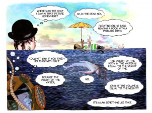 Bloom is, and will always remain, much more fun. I needed to show that right from the beginning, and so made the decision to work the chapters chronologically instead of in the order of the novel. It was hard to work the Stephen bits of ‘Telemachus’ and keep them as dusky and cluttered as they are. Frankly, I think I wound up giving Mulligan a bit more of a show there to contrast the darkness of Stephen.
But, yes it was all pretty consciously done in terms of design. I really wanted to make Bloom seem much more fun to follow right from the start.
There certainly are some issues of developing style. There always are. In this case we were making that first chapter long before the iPad’s release, and that led to a lot of changes in the production process. There are even a few early pages of ‘Telemachus’ where the original version of the panels were formatted for small screens like the iPhone. But by the time I was drawing ‘Calypso’, we knew where the work would go and how to get it there.
Do you think the comics form is well suited to depicting the stream-of-consciousness technique Joyce employed?
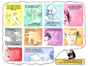 Very much so. Stream of consciousness, as a narrative technique, requires some surprisingly visual and cinematic elements, like pastiche and montage to reveal the story. Those are the real guts of the comics narrative technique as well.
There are so many spots in Joyce’s novel where comics become the purest language for recounting memory, much more so than film or staged readings. Comics are, after all, a reading experience in which time is both fluid and malleable, and that’s something I’m sure he’d have been fascinated with.
In part two of the interview, Rob tells us about how the literary establishment has responded to his work, the controversy over nudity in it and which classic comics James Joyce was a fan of.
Ulysses “Seen” is available as an app for the iPad (currently containing the first two episodes of the book), while the pages also appear on the website of the James Joyce Centre in Dublin; there you can find the ongoing third chapter of the work, a conflation of the ‘Lotus Eaters’ and ‘Nestor’ episodes.
In addition to his work on Ulysses, Rob has also contributed illustrations to a very special centenary edition of The Dead, the concluding short story in Joyce’s anthology Dubliners, published by Dublin’s Stoney Road Press. While the hand-printed book, in a limited edition of 150, comes in at €1,320, there’s also a Kindle edition for the rest of us!


