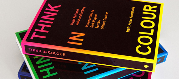
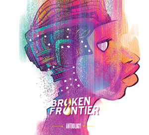
In a book that could provide comics creators with a few lessons, graphic maestro Hugo Puttaert sets out an extensive overview of his achievements in the design world, combining discipline and social responsibility in a beautiful palette of compositions.
On my return after the summer break, it wasn’t my intention to devote a complete column to Think in Colour, Puttaert’s collected art book.
However, as an art director at a small design agency, and interested in not only the language of comics but also their outward appearance, I found Think in Colour to be an incredible asset to my aesthetic and moral views on comics and design.
And since design in comics has become more and more prominent (looking at you, Jonathan Hickman) , I couldn’t resist this opportunity to spotlight one of Europe’s leading designers.
As Hugo Puttaert, graphic designer, visionary artist, professor, editor and head of communication agency Visionandfactory, puts it himself: “The book is a political call for the recognition of the complexity and the nurturing of nuance, even in the domain of communication and graphic design”. And I couldn’t agree more.
One especially enlightening eye-opener is the contextualization by Rick Poynor and Steven Cleeren, who offer insight into the “studio’s history and work processes, as well as into Hugo Puttaert’s vision of design as a discipline and the social responsibility of the designer”.
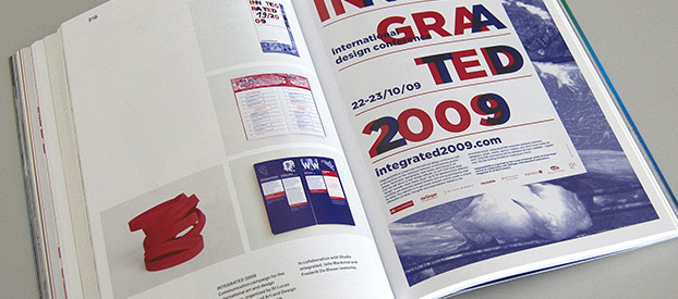
The accompanying text is in black and white, leaving all the color for the showcase pieces – to remarkable effect. Explosions of color fill the pages, shaping typographic elements into coherent compositions with photographs; philosophical or humorist afterthoughts provide food for the mind; and the elegant designs reflect on the design process itself. It is obvious that Puttaert is open-minded about his ‘style’ and is able to adapt to whatever approach the project demands.
The book is designed by Swiss artist Dimitri Jeannottat and is structured by color. It covers the period from 1982 to 2014, meaning that projects from 20 years ago stand side-by-side with more recent work. Puttaert himself describes the book not just as a showcase, but also as a way of looking at how he works, lives, teaches and designs.
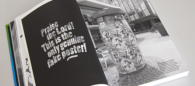
Probably the best example of this is the commissioned work he did for an arts exhibition called ‘Fake’. Together with an illustrator, he came up with a graphite pencil drawing coupled with ‘bad’ Photoshop coloring. The work was refused by the curator, and Puttaert decided to print the poster at his own expense. Printed with phosphorescent ink, the following text appeared on the poster at nightfall: ‘Praise the Lord! This is the only genuine Fake poster!’
Instead of being offended, the organizers were so pleased that they asked for permission to use the posters in their promotion of the festival, and soon nobody talked about the official posters any more. It is this firm believe in good design and communication from the guts that sets Puttaert apart from other designers.
To get back to comics, graphic design is becoming more and more important as companies do battle on the direct market racks (or the digital rack) to draw a potential buyer’s eye to their comic. There is great cover work being done on the outside of comics, but the insides have also often seen changes, with panel borders being left off, digital effects used to display speed or explosions, lettering in see-through or borderless shapes etc.
Image Comics springs immediately to mind, with bold, striking typographic designs where creators are obviously not tempered by commercial or brand restraints and are more keen to push the envelope in order to stand out from the crowd. But even Marvel Comics tries out something new once in a while, with only poor anachronistic DC Comics keeping themselves stuck in the old mode of cover design.
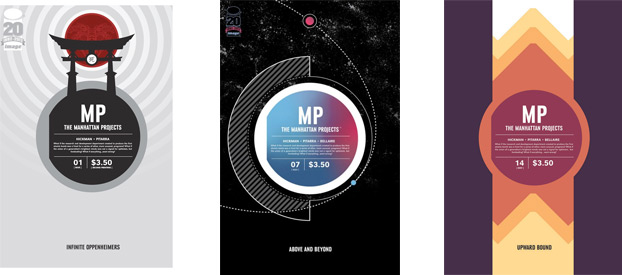
Jonathan Hickman’s covers for Manhattan Projects stand out on the racks with their highly abstracted content.
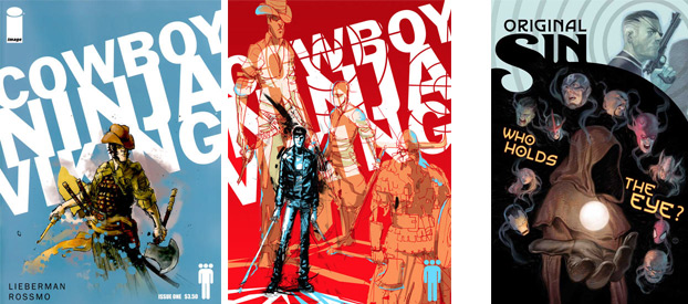
A bold and striking typographic approach is combined with Riley Rossmo’s scratchy and dynamic artwork to create a solid tension between art and design, while Marvel Comics fuse a classical typeface with a graphic shape for their new event series, Original Sin.
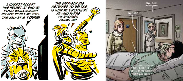
Audacious approaches to lettering: Rocketo (left) by Frank Espinosa, employs solid triangular pointers to indicate who’s speaking, while Todd McFarlane’s Spawn spinoff Sam & Twitch uses a variation on this approach but add a shadow to the letters, as well as loose linework, to indicate the speakers.
Compared with the classic approach to superhero comics covers, it’s obvious that the better designed examples have more character, are able to tell more story and are generally more exceptional than just the standard ‘cool superhero pose’ covers that DC and Marvel generally produce.
If you are interested in graphic design, whether in comics or on other fronts, I highly recommend Think in Colour, which manages to be more than a showcase, presenting a time capsule that wraps a complete vision with in-depth textual analysis within 384 magnificent pages.
American graphic designer Tibor Kalman said, “Good designers make trouble”, and that adage certainly applies to Hugo Puttaert.
Visit the website of Think in Colour for even more information and previews.
Think in Colour by Hugo Puttaert is published in English by Mer.Paper Kunsthalle. It is a 384-page full-colour softcover and retails for €45.


