 In ‘Covers Album’ each Wednesday we ask comics creators, publishers and commentators to pick three of their favourite comic covers …but with a small twist. One must be chosen for aesthetic reasons, one for inspirational reasons and one for pure nostalgia!
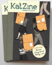
This week it’s the turn of Katriona Chapman – acclaimed comics self-publisher and part of the Avery Hill Publishing team – to give her thoughts. The most recent issue of Katriona’s much lauded autobio series Katzine was recently reviewed by me here at BF when I described it as “just perfect”. She is currently working on her first graphic novel.
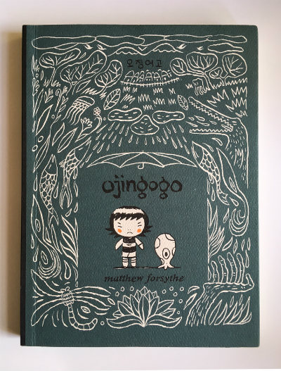
Aesthetic Choice: Ojingogo (2009) by Matthew Forsythe (Drawn and Quarterly)
This has long been a favourite cover of mine. From a book design point of view it has a lot of great stuff going on, but also manages to look simple and elegant at the same time due to the clever use of a limited colour palette. Sticking to the teal colour plus black and white (and a TINY bit of orange) means that in spite of all the detail, the cover illustration doesn’t feel busy.
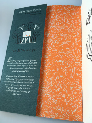
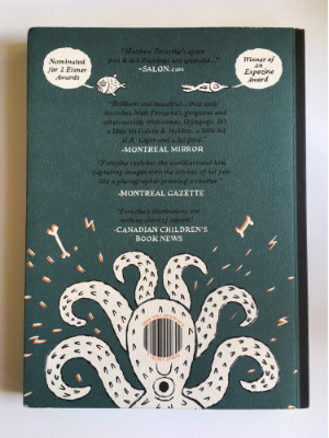
The back cover is almost more amazing still… I always admire when people make the barcode a design feature instead of an eyesore! The little fish with speech bubbles which draw attention to award nominations are really clever, and the hand-lettering is lovely. The cover also has french flaps and a gorgeous endpaper design PLUS it’s printed on textured card stock so it’s a winner on all levels as a beautifully designed book cover!
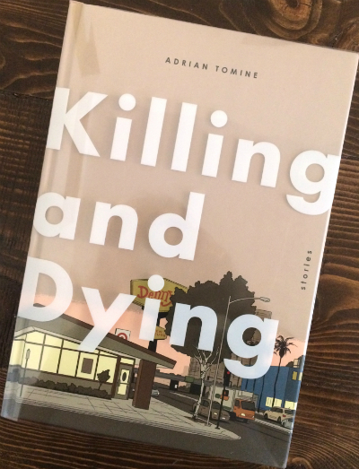
Inspirational Choice: Killing and Dying (2015) by Adrian Tomine (Drawn and Quarterly/Faber)
I’ve chosen this one as my inspirational pick for a few reasons. Like Ojingogo it has some fancy book design features… it’s hardback with a transparent dust jacket that has the title printed on it in white. You can see the illustration underneath through the lettering which just looks really nice and maybe gives you the sense of looking at the cover scene through a window, mirroring the windows in the illustration. I like covers which give a sense of place, and I also quite like covers which don’t show any characters! This wraparound cityscape is beautifully coloured and evocative. It’s also inspirational for me in it’s use of open space and giving enough room to the lettering, which is something I’ve been trying to get better at in my own work.
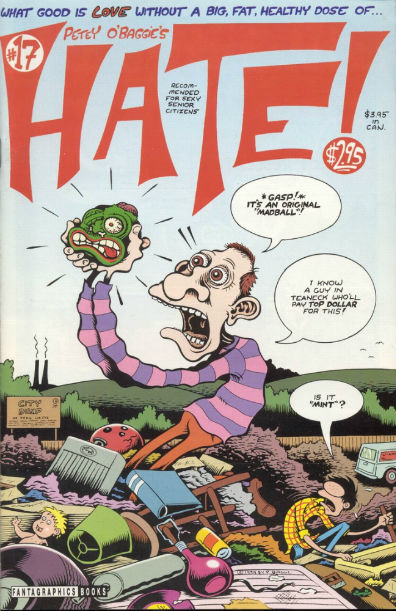
Nostalgic Choice: Hate #17 by Peter Bagge (Fantagraphics Books)
I’ve picked this as Hate was one of the first comics I was really blown away by as a teenager. My friend Bob introduced me to Hate, and I redrew another of my favourite Hate covers as a wedding present for him when he got married years later, with him as Buddy and his wife Lee as Lisa. There are so many good covers in the series, but as this is about nostalgia I thought I’d pick the Madball cover as it also takes me right back to my ’80s childhood! The way Peter Bagge draws figures and expressions always makes me wish I drew less realistically. There’s nothing as great as a Peter Bagge character in an angry rage!
For more on Katriona Chapman’s work visit her site here and follow her on Twitter here. You can visit her online store here to buy her books including Katzine.


