 In ‘Covers Album’ each Wednesday we ask comics creators, publishers and commentators to pick three of their favourite comic covers …but with a small twist. One must be chosen for aesthetic reasons, one for inspirational reasons and one for pure nostalgia!
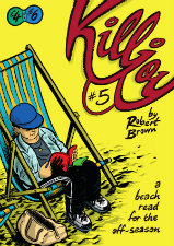
Our artist making those difficult decisions this week is autobio comics creator Robert Brown whose Killjoy series – detailing anecdotal adventures from his often awkward childhood days – has been much lauded in our ‘Small Pressganged’ column here at BF. You can read a review of the most recent issues here. Pick them up! You really won’t be disappointed.
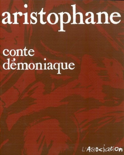
Aesthetic Choice: Conte Démoniaque (1996) by Aristophane (L’Association)
Selecting an item for this section was the most challenging of the three, as I find it difficult to separate the aesthetic quality of a comic’s cover from its inspirational and nostalgic pleasures. Sometimes the pleasure of a comic’s cover is in its vibrancy, its shameless pulpiness, or the very fact that it has a nice drawing rather than a gauzy stock photograph with a bizarrely tenuous thematic relationship to the content it packages, like a modern novel.
However, the attractiveness of my choice here, the cover of Conte Démoniaque by Aristophane, is in its restraint — which, unexpectedly, became a theme for all three of my ‘Covers Album’ selections. Conte Démoniaque is a thick tome of relentless horror, a chthonic journey to rival Dante and Bosch. The book is frank in its infernal depictions, inked with increasingly frenzied lashings of the brush; the cover, by contrast, is a model of French subtlety in design (even if it’s almost strident compared to the lovely plain white covers of so many of their novels). White serif text against an enlarged detail of a representatively hellish panel, given a wash of blood red: it’s graceful and perversely tantalising.
Inspirational Choice: Mauretania (1990) by Chris Reynolds (Penguin Books)
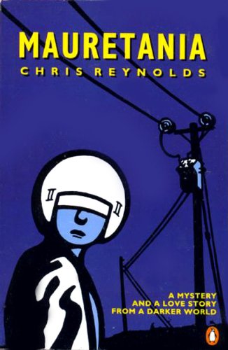
Seth’s major appreciation in the Comics Journal #265 and the high regard of those that know his work notwithstanding, I still feel that Chris Reynolds’ Mauretania comics are dishearteningly underrated. His work in Mauretania Comics and its associated publications (especially the 40-pager The Dial, my favourite comic book) stands as one of the finest corpuses of any artist in the field. I have chosen the front design of his 1990 graphic novel Mauretania as an example of his subtle skills as a cover artist.
As with the pages of his comics, Reynolds’ cover is a masterclass in the interplay of spotted blacks and negative space; before one even bothers the spine of the book, he begins to defamiliarise the things of our world, like the crucial telegraph poles, mostly silhouetted, evoking the strangeness of the quotidian, and the mundanity of the extraordinary. In addition — for the interior pages of his Mauretania comics of the 1980s and ‘90s were always black & white — his choice of colours is striking in its foreboding chilliness and spareness of palette.
I’ve already publicly flaunted the inspiration I’ve drawn from Reynolds’ work in my contribution to Orbital Comics’ Underneath exhibition in 2015 — and yet, it was only during the process of compiling the selections for this article (listicle?) that I finally realised that I unconsciously ripped off his posing and placement of the foreground character when drawing the cover of my own Killjoy #1.
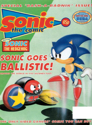
Nostalgic Choice: Sonic the Comic #11 (1993, Egmont Fleetway)
Sonic the Comic #11 was the first comic that I read (or, at least, the first comic that I specifically remember reading) — and so, the choice of its cover in this section was inevitable. This acquisition marked the beginning of my love of comics and of reading for pleasure in general. The fortnightly stories of STC added layers of character & narrative depth to the platform games to which I was already devoted, and inspired my earliest attempts at cartooning. (Now you know who to blame.)
As for the cover itself, it is not the loveliest example that I have ever beheld — but its simplicity and sedateness of form contrasts favourably with the cornea-searingly overburdened cover compositions of today’s newsstand children’s periodicals. The ‘world’s fastest hedgehog’ is pictured almost frozen in time, above delicate trails of blue and red, suggesting a softness of motion in curious counterpoint to the electric promise of his journey “around the world in five seconds flat!” The primary-coloured figures of the eponymous hedgehog and his foe are finely rendered in airbrush tones against a background of flat green shapes; while the world of the videogame is a richly visualised playground for the player’s exploration, the setting of the comic sits back in vagueness and implication to foreground the story and its agents.
How could I resist “the only video gamers’ comic you can buy”, on the cover of which was thrice emblazoned the forename of ‘the Blue Blur’?
[Editorial note: despite a thorough online search, and the input of a number of professionals working in UK comics at the time, we have been unable to identify the cover artist for this issue. If any readers can verify who this page was by please let us know!]
For more on Robert Brown’s work visit his site here and follow him on Twitter here. You can buy issues of Killjoy from his online store here.


