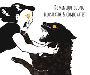


Our Inside Look feature at Broken Frontier provides creators with the opportunity to share exclusive commentaries on their comics projects with our readers, giving insights into the genesis, process and themes of their work. It’s one of the oldest regular features at BF, first appearing on the site back in the mid-2000s. Today our own Myriad First Graphic Novel Competition-winning team member Jenny Robins talks in depth about her creative approach, with particular insights into her graphic-novel-in-progress Biscuits (assorted). Those wanting to check out Jenny’s work further should make sure to follow the links at the end of the article!
Over to Jenny…
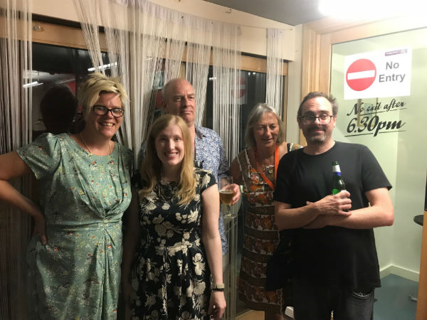
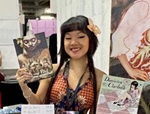
2018 Myriad First Graphic Novel Competition winner Jenny Robins (second left) and, left to right. judges Kate Evans, Martin Rowson, Corinne Pearlman and 2012 winner Gareth Brookes
I’ve talked quite a lot about the struggle of finding and maintaining a distinctive voice and visual style as any kind of artist, but especially as an illustrator. Looking back at my output that could be organised under a hashtag of comic art over the years though, I think there are threads that can be followed. I’ve always mostly actually been saying the same things in not so different ways. My page design skills have definitely come a long way (and hopefully will continue to develop!), but I was never short on ambition.
Recently at the Laydeez do Comics Festival 2019, the esteemed Steven Appleby said something that I’ve been keeping in mind since. Steven said that what they’d been looking for in choosing the shortlist and winner (the amazing Niki Bañados) was work that was both “ambitious and engaging”. What good things to aim for. Quite intimidating.
Over the last 5 or so years since dipping my toe into the London Small Press scene I’ve also heard a lot of wisdom on the topic of ambition and pacing oneself. Don’t try to do that graphic novel in your head first, wise people told me (most memorably, and repeatedly, Mark Stafford), do short comics so you can learn how to comic. So the one that I’ve had bubbling and evolving in my head since Uni (12 odd years) remained strictly inside my head and I made short comics in between and around my other jobs and my life.
I made short comics for Solipsistic Pop, Meanwhile…, Over the Line, Animate Europe, Dirty Rotten Comics and, of course, the Broken Frontier Small Press Yearbook and a few for my own purposes. And along the way another idea for a long form project was born. Last year that project, Biscuits (assorted), won the Myriad First Graphic Novel Competition, and that means that now I’m working on finishing it into a proper long book. I’m about halfway through. It’s aiming at being published in late 2020. It’s very exciting.
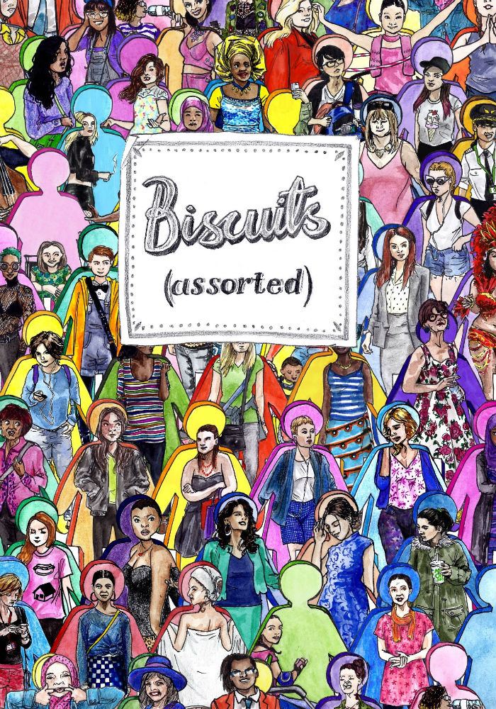
It’s not the project I thought I would be doing for my first full-length graphic novel, but it’s the kind of work I’ve always wanted to do. The book follows overlapping stories of different women living in London, and it grew out of an illustration project in which I drew a number of women (biological and otherwise) coming out of their own cookie cutters and being steadfastly themselves – messy, incongruous, a mix of the expected and unexpected. Because of its broad and fragmented structure, it’s a project that’s allowed me to look anywhere and everywhere for inspiration, to keep endless oblique notes that may or may not go anywhere.
This approach suits me because what I’ve always loved about creating any kind of art is the process of casting the net out for inspiration and harvesting the serendipitous pickings. I have this foundational belief that all creative endeavour is a collaboration with the universe. The art I make on this day could only have been made on this day, and will be different to art if I had set out to make it on any other day. Even intensely involved and complex authorial projects rely on a thousand, thousand tiny decisions that are partially from outside of our control. This is a beautiful thing and as creators we have to dance the dance of finding the happy accidents.
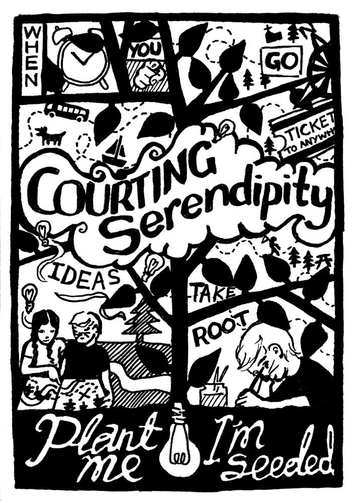
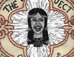
This was the concept I was beginning to grapple with back in 2011 when I drew this for Solipsistic Pop #4 The theme of the issue was maps, and this became a screenprint on card embedded with seeds, so that it could be planted and become, well… plants. I wonder how many of them ever got planted?
I liked the idea of the lightbulb, as a symbol for an idea, being at the root of the tree, and the branches forming the panel borders. I also like that you can read the central text ‘Courting Serendipity’ as a title, or as part of the sentence, so it’s like an illustration and a comic at once. I had to rein in my detail addiction because the design was going to be screen-printed, which also encouraged me to think carefully about the balance of the blacks because I wanted to make sure that the ‘Plant me I’m seeded’ text at the bottom looked separate enough to be taken as a separate statement. Hand-drawn text is something I love doing. I also wanted to play with the idea of a map, because when they’re drawn in this simple sort of style like a pirate’s treasure map we tend to think of them as showing us a single route to follow, but really maps are there to show us all the different routes we could choose to take. I think maybe I’m always riffing on this territory of seeing the potential for adventure and childlike wonder in the everyday, if often with an edge of cynicism. At the time I was beginning my art teaching career, and I had been writing essays on the nature of inspiration and creativity.
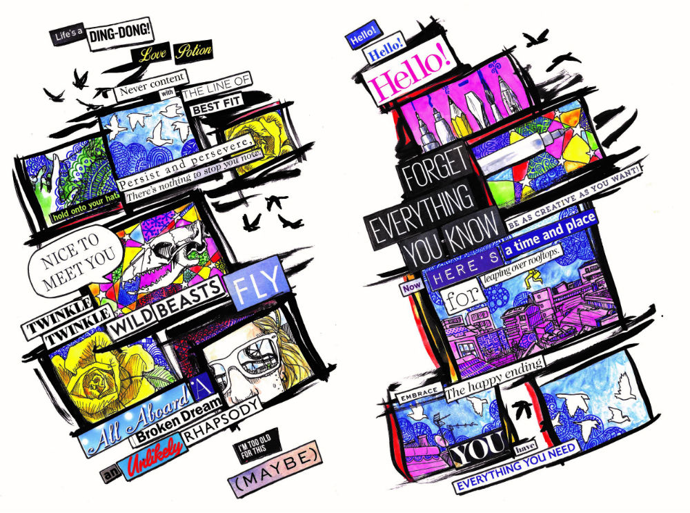
After that summer, I got too busy with learning to be a teacher and balancing that with the occasional illustration commission for a while to do any kind of fun comics work. In 2014 I did a 4-page love story comic based on found text collage for Meanwhile… at Soaring Penguin Press. It was cool, but didn’t really make a whole lot of narrative sense due to the found text element. When I heard about the Over the Line poetry comic compilation a year later, I thought I should embrace that lack of syntax by lending the collage technique to poetry. This is the result and I think it works nicely.
Being both collage-based and poetic, I embraced another serendipitous approach to choosing the images I included. Which is to say I made them up as I went along and took that which was to hand as inspiration. The drawing of me in the sunglasses is from my favourite ever selfie that I took at Thorpe Park. The birds and roses are pretty standard content for me to be honest. I draw a lot of birds. At the time I was also working on the second of my What Birds are Really Thinking zines, and the mandalaish zentanglish patterns are from that.
The rest of the images are rooted in the text. I don’t remember where the words came from, but ‘leaping over rooftops’ was a chance for me to play with the angles of intersecting buildings – something that I’m now doing a lot of in Biscuits. Most of this colour is watercolour, with the patterns added using Steadtler fine liners. The panels and the messy birds outside of the grid are drawn in Indian ink. I also tend to whack the saturation up and tighten up the levels on Photoshop in everything I do. Love bright colours.
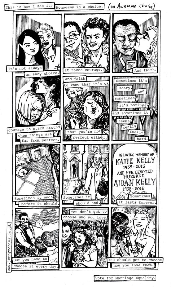
Also in 2015 I did this on- page comic for Clíodhna aka Ztoical’sproject campaigning for the marriage equality vote in Ireland. This is getting closer to the style I am currently working in, with the detailed black and white portraits and heavy use of striped tonal areas to manipulate the composition of the page. I use a lot of photography and video stills to source my expressions and poses when I’m drawing but I have a complex relationship with the prevalent posed photo portrait, be it selfie or otherpersonie. Although this comic is mostly a series of couples, basically none of the characters are looking at the audience/camera. Because they are looking at each other. And it’s about monogamous love. So that makes sense.
But also I just really think people are more interesting when they’re not making their photo faces. I typed the text for this and then printed it and cut it out and stuck it down before doing any of the drawings. This is a compromise keeping some of the energy of the found text collage look, while having total control over the words. I used the same technique in the Animate Europe comic I did in the same year. It sits on top of the 9-panel grid, which enhances the feeling that the text is a voiceover or commentary, with the images supporting the text. With each image though I tried to pack it full of character, so there is a sense of real lives that we are seeing a snapshot of.
I angsted over some elements of this comic because when dealing with a topic that is both simple and complex, there’s always a risk that you’re going to offend someone. I worried that the central panel that implies domestic violence was overly stereotypical, I worried first about being too pro-monogamy, and then not being pro-monogamy enough (that’s why the awesome choice part is added in by hand) and this was my first grappling with the angst of diversity and privilege.
t’s ok though. I know I can’t please everyone. Now that I’m working on Biscuits, a project which is explicitly diverse, and yet written and drawn by this one same middle class, CIS, white woman (me), I need to tread a tightrope between retaining my voice, and researching enough that others voices aren’t too cringe-inducing or indeed, actually offensive. My characters include teenagers as well as adults from lots of different backgrounds, so I know I’m not going to have a 100% idiom accuracy rate. It is what it is, and since the premise is about people being incongruous and subverting expectations as often as they fulfil them, I hope I hold onto a feeling of possibility, if not likelihood.
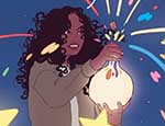
Each character in Biscuits has a colour illustration of themselves emerging from a cookie cutter, which proceeds each time they appear in the book. I’m going to use the final three inside look images to introduce you to the three most important characters.
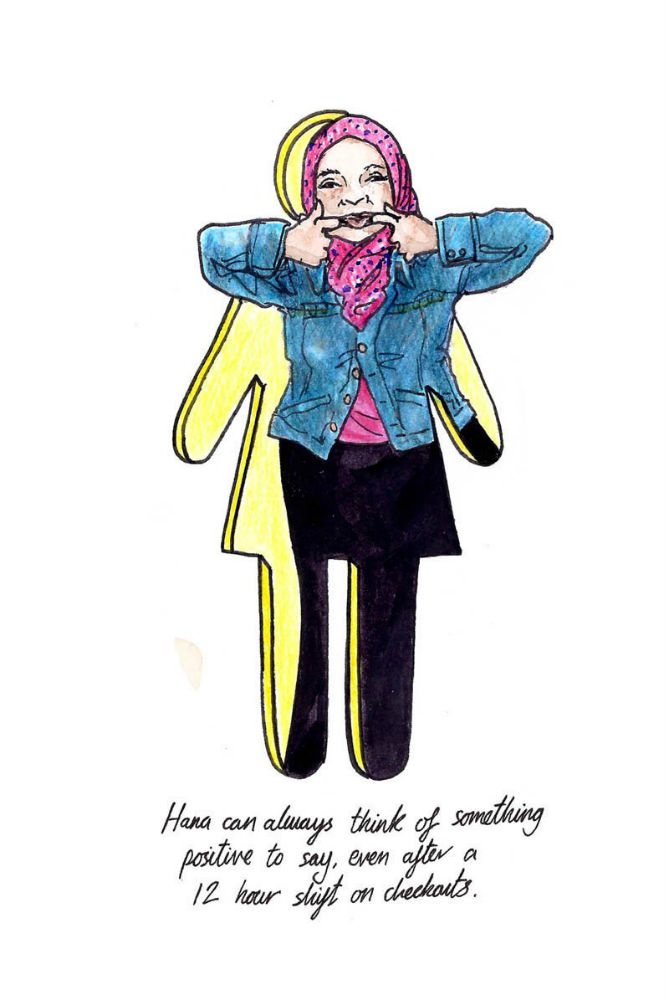
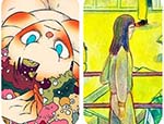
This is the first two pages of Hana and will probably be among the earliest pages in the book. Hana is a perpetually positive character who takes it upon herself to introduce her newly immigrated supermarket co-worker to the delights of London life – as seen through her rose-tinted lens. As you might imagine this is not going to go entirely to plan, but that’s a way off in the book. Here we see her in her element stacking shelves and chatting on in poorly informed pop psychology. She is the hero we need. I had so much fun drawing these early Hana pages with all the crowds and the detail and the perspectives in the supermarket.
As these pages continue, the similarity between the numerous and diverse people of London and the products on the shelves of her workplace is signalled visually in a few ways. Diverse yes, seemingly endlessly so – but also sortable, categorisable. We all have to eat after all, but eating is one of those things where you don’t realise how habit-bound you are and how little of what’s out there you take advantage of till you look at the shop of the person next to you in the supermarket queue and notice how it’s full of things you would never buy. And that’s just in the supermarket. What about the actual markets? The corner shops? The deli? The department store food hall? The bins round behind the station?
Most of the reference for these pages came from around King’s Cross and St Pancras stations incidentally. One of my favourite sources of candid photos of people standing still is waiting at crowded crossings to cross the road. If you frequently cross the road from Pentonville Road towards King’s Cross Station that’s on my commute, so you might turn up in my comic, although I usually will change something about you so I don’t feel too bad for stealing your actual likeness.
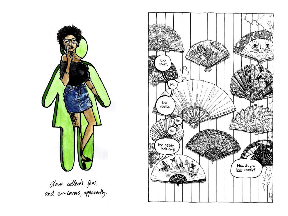
This is the first page of Clara’s story (which is about much more than her collection of fans). I also just had a thought for the first time looking at this page and I hope it’s not a spoiler to assert something right now: Clara’s flat is not damp. The wallpaper is peeling. Which I just realised does imply that maybe her flat is damp. I think I need to go back and find somewhere I can assert this in the graphic novel because I don’t want anyone to think that Clara is the kind of person who would hang their fan collection on the walls of a damp flat. Yes a lot of poorly maintained rented flats in London are damp. This is not one of them. She probably has a dehumidifier as well, maybe I will draw one in a later scene. I’m glad we’ve had this moment of shared epiphany, what did I say about being open to inspiration and insight?
Anyway this is Clara and her story concerns romance and self-actualisation and all that stuff. Also internet dating, cohabitation and wedding favours. And a dog. This page is another self-indulgent detail fest on my part, I really like drawing things that have subtle tonal variation and complex angles but doing that in pen because it forces you to make choices about what to leave in and what to leave out.
On the next page you get to see who Clara is talking to as we zoom out to see her kitchen table with this wall seen through the doorway into the hall. As Hana’s environment is mostly the supermarket, Clara’s is mostly her small flat, which she shares with Helena and Edgars. Creating these environments has been as big a part of creating the characters as the design of their face, figure and wardrobe.
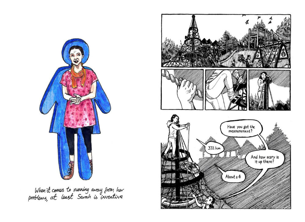
And finally this is the first page of Sarah’s story.Yes I’m aware all of my main characters’ names rhyme. There’s also a Maya. It was not intentional, but I’m fine with it. In Sarah’s story she is conducting a summer long project with her young daughter Milly, into the playgrounds of the city. A lot of opportunities for luscious detail here for me to draw as well. Throughout Sarah’s sections of the book the page design is more open, with more borderless panels and unusual angles. Sometimes the pages dissolve into diagrams and graphs, or tangles of skyline and climbing frame. This story is both intensely physical and of the moment (as shown in the close-ups of Milly’s climbing experience) and cerebral and abstract – like both of them are trying to tame the real world and pin it down in a table. You can see I’ve snuck some pigeons in there too.
When I was a young daughter myself, I loved playgrounds. I loved running through tunnels and climbing on things and basically pretending I was Mowgli or a Power Ranger or someone good at running and climbing and things. I have lost most of my flexibility and upper body strength, but I still remember that feeling. I don’t think I was really the kind of kid to collect data. But Milly is. She is both. She likes running and climbing and data. What about Sarah? You’ll have to buy the book when I’m finished to find out.
For more on the work of Jenny Robins visit her site here and online store here. You can follow her on Twitter here and Instagram here.