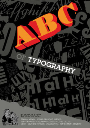
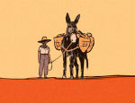
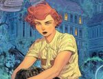
If you thought typography was boring, David Rault and his roster of 11 comic artists will make you eat your words – each chapter a delightfully different visual course in this delicious tasting menu of the history of lettering.
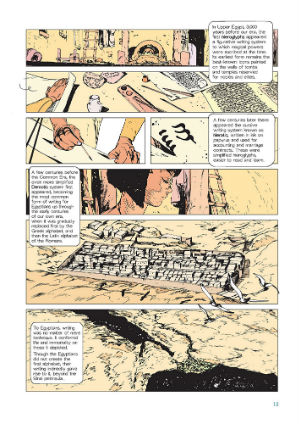
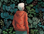
Right – ‘The Birth of Writing’ illustrated by Aseyn
First published a year ago (November 2018) as ABCD de la Typographie by Gallimard BD, ABC of Typography is a fine addition to SelfMadeHero’s catalogue of arty translations. Author David Rault really knows his stuff when it comes to picking apart the origins of what we now see most often through a screen but was once more commonly carved, cast, or even handwritten. As well as an affectionate portrayal of the evolution of the technology involved, Rault namechecks a plethora of famous typographers from across the years, valiantly trying to make up for the enormous boys club of typography’s history (I counted five female typographers in a cast of hundreds, but I may have missed a few) by including two female artists in the roster of illustrators. (I’m sorry, I know, it’s French, I can’t help myself). Perhaps most interestingly though, Rault also picks apart the origins and influences behind some of our persistent associations with different styles of lettering. He considers both the design features of the letters involved, and the contemporary cultural and political factors linked with their uses. Although very much a global history, there’s also a definite French slant to the information here. SelfMadeHero were quick to point out the featuring of Britain’s own Eric Gill in their British press release; the book makes no mention of some of his more infamous life choices of course because this is a book suitable for children, and also there’s really very little time for biographical details as there are so many, many typographers to mention.
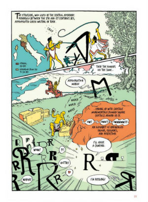
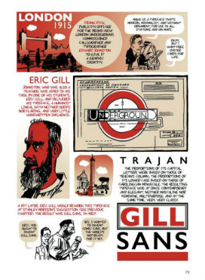
The Romans and Their Writing – art by Singeon (left) and From Bauhaus to Gill Sans – art by Hervé Bourhis (right)
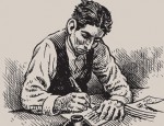
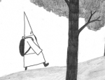
Apart from a couple of instances where the temptation to just list a whole bunch of those guys and their fonts is given into, the writing is well paced and engaging, credit to Rault and the translator Edward Gauvin of course. I don’t know about the extent of back and forth in the editing process, but it seems since each chapter is really so different that the artists involved were given relatively free rein with their page design. From Aseyn’s pleasingly evocative scratchy portrayal of The Birth of Writing through Singeon’s tropical time traveling Roman period, Delphine Panique’s charming characterisation, Hervé Bourhis’ modernist minimalism, Anne Simon’s adorable monochrome square cartoon grids all the way to veteran François Ayroles’ ingenious balance brought to an information heavy final chapter.
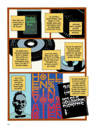
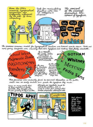
Although one joy of the book is seeing how the different artists tackle drawing the typographic designs themselves, ironically the lettering in some parts of the book could definitely be better. The text in Delphine Panique’s chapter ‘From Humanist to Didone’ is quite difficult to read and the font used in Jake Raynal’s section on ‘Letraset and Phototypesetting’ has a C that is very similar to a left hand bracket, making sentences like “This brought typography into the home (and cheaply!) decades before the arrival of the p.c.” hard to decipher. All of which really does go to underlining how this typography lark really isn’t as easy as it looks. I also have to say visually, Raynal’s section was definitely one of my favourites, really making creative use of the potential of the combination of lettering, colour and layout within his pages.
‘Letraset and Phototypesetting’ – art by Jake Raynal (left) and ‘Typography Today and Tomorrow’ – art by Francois Ayroles (right)
Like most visual arts, the model of distribution has radically changed over the years for typography and it’s always had a markedly different place in our hearts and minds than art forms that are less tangled up in the language centres of our brain, drawing on aesthetic and semiotic understanding’ often subconsciously’ as we absorb the words it conveys. Not taking type seriously though, leads to all sorts of terrible design, and if this book reaches the hands of a few future amateur poster makers then the world will be a better place. Whether you’re switched on to the importance of text design or take the dropdown menu entirely for granted, there is much you can learn from ABC of Typography about the long, long (or sometimes surprisingly short) histories of some of those familiar names… and you’ll enjoy yourself while you learn.
David Rault (W), Seyhan Argun, Aseyn, François Ayroles, Hervé Bourhis, Alexandre Clérisse, Olivier Deloye, Libon, Delphine Panique, Jake Raynal, Anne Simon and Singeon (A), Edward Gauvin (T) • SelfMadeHero, £14.99
Review by Jenny Robins


