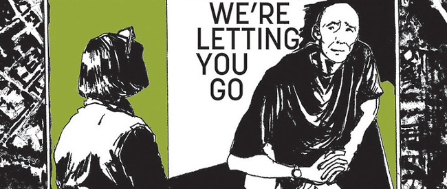
One look at Alison Sampson‘s art lets you know that hers is a unique talent – but one look isn’t nearly enough to take in the myriad details and emotional power that her work conveys.
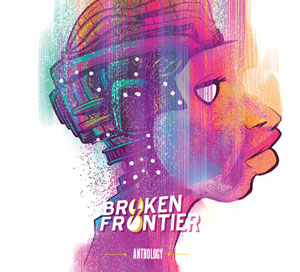
Alison Sampson is contributing to the Broken Frontier Anthology, created to celebrate the magic of creator-owned comics. Check our Kickstarter campaign and please share it with your friends on social media using #BFanthology. You can find Alison on Twitter @itsthatlady.
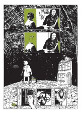
With 25 years of architectural experience, Sampson is adept at bringing form out of nothingness, which, interestingly, is an idea at the core of her graphic novel debut, Genesis (written by Nathan Edmondson).
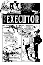
Since then, Sampson’s body of comics work has been growing through covers and anthology contributions, including a story in Creepy #18 with her Broken Frontier collaborator, Fred Van Lente. In our interview, she discussed her process, influences, and where she wants to take her comics career next.
How did you get started in comics, and how did your architectural career prepare you for this venture?
I read a few comics when I was younger – 2000 AD in the 1970s and up to about the mid-1980s. There was a really long gap until relatively recently, when, with the glut of comic book films coming out, I looked at comics again, buying Watchmen off the back of a film magazine article, perhaps a year before that film came out.
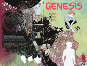 I had an art blog, space in text, where I recorded what I found out about comics, and then, about three or four years ago, the artist Rob Davis suggested I write and draw my own comic. This, my first comic (about architecture), was published in Solipsistic Pop 4, and then Nathan Edmondson saw a page of that online and asked me to draw the comic that became Genesis, and I did.
Since I started Genesis I’ve drawn a western, all-ages work (with Spera), Creepy, gothic fiction, a load of covers (including for the UK’s Guardian newspaper), and I’m trying to extend out my design opportunities, as that really is my background (also it is what Steve Wacker advised I should do, and he gives good advice).
I like thinking of the comic as a ‘thing’, so it isn’t just about the pages for me, but how the whole object goes together, and I enjoyed designing Genesis (and the book I am currently working on) in its entirety. In architecture I specialise in big, highly commercial good-looking projects, most of which is award-winning: public buildings, universities, schools, offices, listed buildings (where you have to be completely on top of the historical make-up of what you are working on).
The architecture background prepares you in so many ways, far too many to list here. One of the best things about it are some of the less obvious things: patience, collaboration, detail, aesthetics, professionalism and meeting deadlines are all day-to-day things in architecture, and it would go without saying I am hardly going to jettison these structures, which keep any art-based business running.
I also believe that designers should never underestimate the capacity of people to appreciate art – I’ve seen it work again and again in practice. Having seen how that commercial success works feeds into my comics work.
Your art is packed with mesmerizing details and diverse influences. How do you approach the process of composition from blank page to finished product?
If I am working with a creator-owned project, there might have been some concept art, and the writer will have drawn on that for script pages. I’ll already know some of what the art basis is. Every story will be different, depending on how the script is written and what we are doing.
I have the script, read it through and draw a small thumbnail, so I know the panel sizes and positions and where people are and what they are doing. I may need to do some research. Being British with most my stories set in very specific bits of the US, I have to look up what the landscape is like and so on. With Genesis, I even had to choose the relevant parts of the US, so that involved me signing up with some realtors to see what the inside of people’s houses looked like. Most things need to be researched.
Amazingly, with Genesis, there are nearly no grounding structures in the latter two-thirds of the book – nearly no buildings, weapons, vehicles, structures or straight lines at all, and this put a lot more pressure on me to get the composition right, as otherwise you would just be looking at a muddy mess.
I pencil layouts at print size, but these are really compositional guides and can look very loose. I scale these up to 150% on illustrator board and pencil the pages tightly on figures and loosely on everything else, then scan them in, print out bluelines and ink those.
Because I design the backgrounds from scratch (its my job to design environments, so why not), I don’t like to draw these in full twice, and I’ll design them around the pencilled figures as much as I can.
In terms of mesmerising details (thank you for the compliment), I like to make the art interesting to look at. I’ll add in things which build out the story and which might be noticed on a re-read. The things a person might have in a room tell their own story, the mise en scene has meaning, the space around figures is a character in its own right. You need to use all the storytelling tools you can.
In terms of influences, I’m very broad and very narrow. I have very, very few comics influences (to have influences in architecture… is not really how it works), but just as architecture draws on everything, I try and do the same with the art.
What can you tell us about your work for the Broken Frontier anthology?
Not a great deal at this time. I’ll be working with the writer Fred Van Lente. His scripts are a delight, really witty and fun to draw, with all sorts of references. We will be pleased to surprise you. It may involve.. hair, and I know there is a female protagonist.
In addition to your other comics work, you are the developer and curator of the ongoing Think of a City project. Could you talk a little about the inspiration for this project and your role with it?
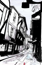
The project is inspired by the lack of actual literary cities in comics. They are there (for example, Mega City One and King City), but very few tell the story in their own right.
The project really started as a kind of game or experiment between a few artists, to begin to sequentially describe a place that didn’t yet exist, that was our city. Just as Italo Calvino’s Invisible Cities is many ways of describing one city (Venice), so everyone in our project is drawing the same city.
When I was drawing Genesis I didn’t get to draw half as much architecture as I thought I was going to get, so I had this thing I wanted to do. I think this is the case for a lot of people – there is just this thing they want to do, and we give a platform for that . We are aiming towards an exhibition.
It’s fun to be part of something that is a kind of experiment and part of a larger whole; we don’t know exactly where it is going to go in terms of how it looks and feels. I originated and designed the project, set the rules, wrote our various texts and put up the various sites we have, and I manage the day-to-day running. Think of a City is a by-invitation project curated by me (currently around 180 people are taking part), and I am working to make it more diverse and less white.
Due to the amount of people we have, our project is a very tight ship organisationally, so it doesn’t become a time sink. Our contributors largely manage the project themselves: we don’t edit, and everyone ‘gets it’- we give out a very detailed technical spec, which people do stick to.
We mimic actual urban development in what we do, and time will tell as to what kind of place we make together. Cities are diverse – a group of voices. Somehow they are more than the sum of their parts, so how does that work? Our story is a dérive, a sequential journey through space where the traveller finds all manner of events, people and things. There is something new round every corner. It’s an adventure on so many levels.
What other current and upcoming projects are on your drawing board?
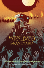
I am working on a short but rather dense series called Winnebago Graveyard, with Steve Niles. It’s a gripping story and involves all manner of things. There are other projects in the pipeline. More will be revealed in due course.


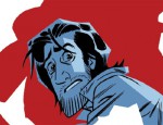

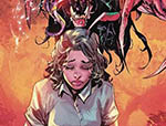




[…] Alison Sampson on Broken Frontier […]
My goodness, great stuff, why are the images not linked to the larger versions!
check these out!
https://www.brokenfrontier.com/wp-content/uploads/2015/06/think-of-a-city.jpg
https://www.brokenfrontier.com/wp-content/uploads/2015/06/executor-page-1.jpg