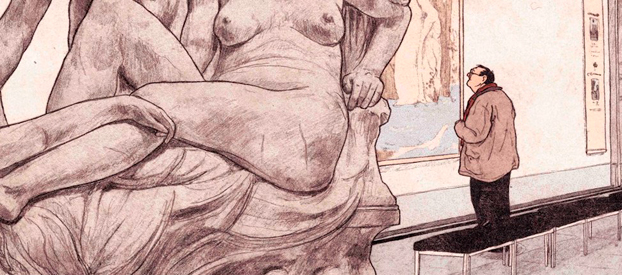
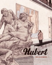
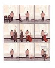
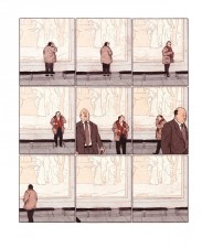
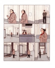
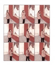
Hubert, Belgian artist Ben Gijsemans’ parable of an introverted art lover, speaks to the human condition, isolated in the chaos of modern life, determined to avoid all opportunities less they should lead to change.
Following its original creation as a graduation project, Gijsemans’ resolution to expand Hubert to a full-blown graphic novel proves to be a solid decision. Characterised by his amazing, fully realised style, drawing on modern graphic sensibilities as much as classic newspaper comics and Art Nouveau, Hubert has been an instant hit among graphic novel lovers.
BROKEN FRONTIER: Did you tap into your own psyche to create your first graphic novel? Did you ‘write what you know’?
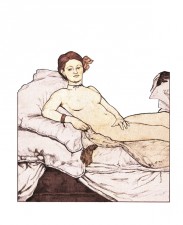
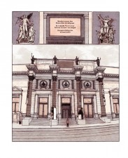
BEN GIJSEMANS: Most definitely. When I started on Hubert I had just started up my life in Brussels, and those first impressions of this extraordinary city reverberated in the attitude Hubert displays towards Brussels. Just like Hubert I’m a rabid museum visitor, and the Royal Palace of the Arts was instantly one of my favorite spots. I’m not stating that Hubert is a future version of myself, but we at least share a passion for the arts.
The largest part of Hubert was written on a small unobtrusive stool in the museum Hubert frequently visits. So I guess there’s always the off chance that I chose the museum location in the graphic novel just so I could spent even more time there. In my first drafts there was neither a museum nor a protagonist interested in classical paintings.
‘Write what you know’ does factor into it then, but it is more a case of ‘write about what you’re interested in’.
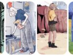
You display an interesting art style, mixing classical drawings with a modern sensibility.
If you looked at my preliminary studies, you’d find that my style was all over the place. I basically started doodling until I hit a style that felt right to me. I then used that style to complete the first chapter as a way of testing the waters, to see that it would actually work for what I envisioned the story to be.
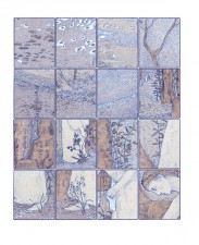
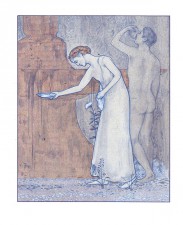
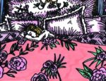
Afterwards I spent a long time looking for a colouring method. It was important to me that you could view the original line work in the end result, so that’s why the colors are rather subdued.
I wouldn’t put my drawings next to Winsor McCay and Hergé, but I can definitely see the influence those two greats had upon my work. The Hergé Museum in Louvain-la-Neuve, near Brussels, was a big source of inspiration, I spent hours looking at original pages from the Tintin albums and they always put my own pages into perspective. (Afterwards, my pages more often than not ended up in the waste bin.)
Your drawings look quite intricate and laboured. From a technical point of view, how are they constructed?
The starting point is the pencil drawing, and if I judge it as good, I just scan it and colour it digitally. I’m usually not a fan of computer textures, so I print the pages so I can manually apply textures by, for example, rubbing material on the printouts. It’s quite a destructive process but it’s definitely fun. I then scan the page once more and finish the details on the computer.
I found the end result to be quite reflective of some of the major themes in the graphic novel.
With perfectly rendered line work, coloring and panel rhythm, Hubert looks like the work of a perfectionist.
Absolutely. It is rare that I’m pleased with my own work. I was often frustrated during the creation of my book and had to learn to accept that some panels turn out less interesting than others. This does not mean that I didn’t redraw every panel the minute I saw some margin for improvement. That took up quite a lot of time, because I kept looking for details that did not fit my vision of the work.
The same goes for the story. I regularly moved pages or panels around to test out the best reading experience. I wanted to refine it as much as possible.
The solitude of the protagonist seems like quite a claustrophobic motif for such a young artist. Did you ever need to discipline yourself to work on the book?
I never experienced it as a ‘dark’ book. On the contrary, Hubert lives his life the way it works best for him. It’s just that his introverted personality does not allow a lot of room for social contact.
From a certain point on, I found him to be quite an endearing character and I wanted to inject that feeling into the book. Hubert derives something meaningful from the painterly arts and I derived something meaningful from my interactions with Hubert. This relationship supplied me with energy to keep working on the book.
Publisher Jonathan Cape immediately expressed interest in your book at the Frankfurt Book Fair. So can we expect an English-language version any time soon?
I’m quite pleased to say yes! There has also been an agreement with the French publishing house Dargaud and interest from other publishing houses.
Hubert by Ben Gijsemans is published by Oogachtend in Dutch. It is a full-colour hardcover counting 88 pages and retails for €19. French and English translations are forthcoming from Dargaud and Jonathan Cape respectively.
Follow the artist at his website and read a preview of Hubert right here.
For more news & info from Europe’s comics community, follow me on Twitter right here.


[…] Fazer banda desenhada é um processo destructivo Entrevista com o belga Ben Gijsemans, o autor de Hubert. Broken Frontier. […]
[…] ITEM! Broken Frontier interviewed Ben Gijsemans, the creator of HUBERT, reviewed by Page 45 above. […]
[…] ITEM! Broken Frontier interviewed Ben Gijsemans, the creator of HUBERT, reviewed by Page 45 above. […]
[…] not quite the same. You might think that he is a sad loner—he looks like one—but Gijsemans did an interview with Broken Frontier, an online zine about comics and graphic novels, and he doesn’t talk about his main character as […]