Our Inside Look feature at Broken Frontier provides creators with the opportunity to share exclusive commentaries on their comics projects with our readers, giving insights into the genesis, process and themes of their work. It’s one of the oldest regular features at BF, first appearing on the site back in the mid-2000s and also one of our most well-received. The second of our Inside Looks for 2023 comes from Lawrence Lindell who, alongside Breena Nuñez, makes up micropress Laneha House. With Lawrence’s eagerly anticipated first long-form work Blackward. Before diving into Lawrence’s creator commentary here’s the Drawn & Quarterly description of the book.
Black, weird, awkward and proud of it. Welcome to the club!
Tired of feeling like you don’t belong? Join the club. It’s called the Section. You’d think a spot to chill, chat, and find community would be much easier to come by for nerdy, queer punks. But when four longtime, bookish BFFs—Lika, Amor, Lala, and Tony—can’t find what they need, they take matters into their own hands and create a space where they can be a hundred percent who they are: Black, queer, and weird.
The group puts a call out for all awkward Black folks to come on down to the community center to connect. But low attendance and IRL run-ins with trolls of all kinds only rock everybody with anxiety. As our protagonists start to question the merits of their vision, a lifetime of insecurities—about not being good enough or Black enough—bubbles to the surface. Will they find a way to turn it around in time for their radical brainchild, the Blackward Zine Fest?
Lawrence Lindell’s characters pop from the page in playful Technicolor. From mental health to romance, micro—and macro—aggressions to joy, our crew tackles everything life throws at them in this heartwarming tale about building a place to belong and the power of community.
Blackward is my first graphic novel with Drawn & Quarterly. I pitched the idea of turning my webcomic The Section into a graphic novel to D+Q in 2021. I hopped on a zoom call with Tracy and Peggy and they were very interested. We talked about Tracy being my editor and expanding on what I had done with The Section. Over the next few emails, we talked about changing the name from The Section to Blackward. The name comes from the original material, but I was skeptical. This was my first time learning to trust my team at D+Q. After self publishing and DIYing it up for a decade, I got used to not only working by myself, but also learning to not rely on anyone. Having this and Random House Graphic be my first experiences working with publishers has been good.
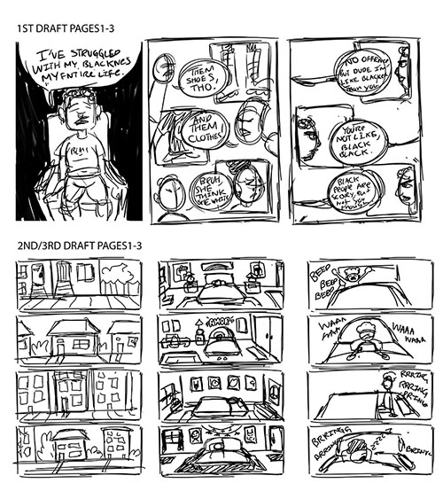
I signed on to do Blackward in Fall of 2021. So it’s kinda serendipitous the the book is coming out in Fall this year. When I signed the contract everything was changing fast. For context, we had just found out my spouse was pregnant (the main reason I even pitched to D+Q in the first place), we lost our unborn child before I even started working on the book. Then we had a storm here in San Francisco and our apartment flooded. So working on the first draft was not ideal at all. I turned in my 1st rough draft in December 2021. I rushed to have something to turn in because honestly I needed to get that second payment. Tracy emailed me back notes and after having some time to breathe, I took them all in, and started working on a 2nd draft. When I sent it back to Tracy, they were surprised at how much of the book I changed and how fast I did it. After another round of questions and notes from Tracy and a few folks, I worked on a third draft and that is pretty much what became the final book. I turned in my 2nd and 3rd rough drafts in June of 2022.
I inked my first final page in July of 2022, went on parental leave from August-October of 2022. I worked on what is now the final book from October until January 2023. And the rest is history!
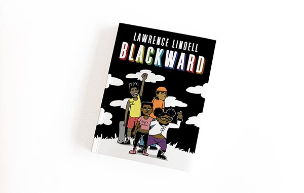
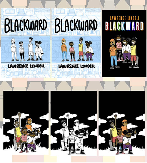
For the cover I initially sent over about 15 different ones that I was thinking to use. My editor let me know that they liked the direction I was headed in, but that they would want to use a bolder type face for my name and title. In the image above the 2 covers with the blue background are mine. The one in black is the mockup D+Q sent back to me. They asked if I could have the characters in a more exciting pose and not in a straight line and maybe use Black for the background. I started sketching and quickly came up with a new cover. I decided that the solid black was too plain, and added in clouds and grass. I originally wanted to color in the clouds and the grass, but D+Q liked the contrast of the black and white.
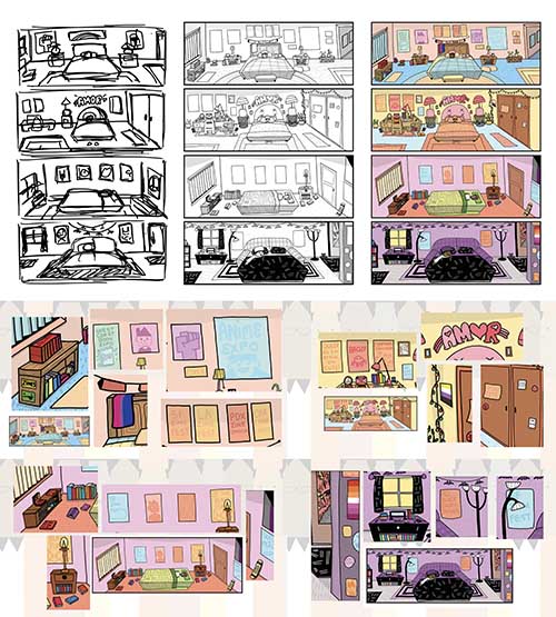
On page 2 of the book we get introduced to the characters, but only through their rooms while they are sleeping. A note I got from my editor was that folks wanted to see more indicating that these four characters are into books, zines and comics and what not. I expressed that I would show that by adding these things into the background in their rooms and stuff. In the first panel we meet Lika (Lee-Ka). There are some key things in her room that lets you know a bit about her. First, hanging above her bed on the headboard is the bisexual flag. That’s my way of letting you know she is bi without expressing it with dialogue, which she does only one time in the book. In the second panel we meet Amor. They are the only one to have their name introduced to you this early. They also have a non-binary flag on their wall. The third panel we meet Tony. The blinds in his room are the only ones out of the 4 to have cracks in them, letting you know that his place might not be the best as we learn later on page 7. There is also an ace flag hanging on his wall, but for demisexuals. In the fourth panel we meet Lala. Her room has a much darker vibe than the others. Because she is a Goth…lol. She has the lesbian flag on her wall. Throughout each of their rooms, I have a lot of nods to zine fests, comics and queer folks. My hope is that in this single page I am able to give you enough information about who these characters are. If not breezed through (comic readers, SLOW DOWN), you get to learn a lot about them in this single page.
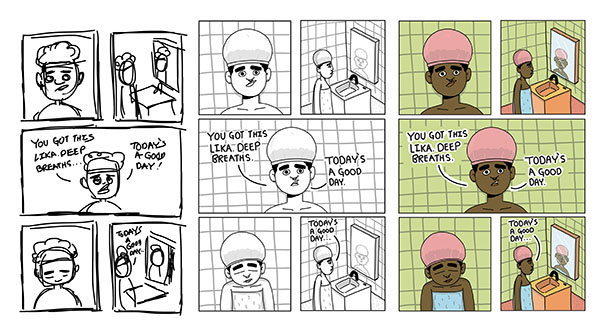
Page 5 is the first time we get to meet one of the characters individually. Lika is in the mirror ensuring herself that today is a good day. Originally the shower cap was solid pink, but I kept remembering what my sisters looked like when they wore shower caps, and you could always see the silhouette of their hair because of the material. So I went back in and added that little detail to all of the characters with shower caps. I don’t know if it will matter to anyone, but it does to me so I added it. For the process of drawing this book, I sketched out rough pages on my iPad. Then inked and colored everything on my iPad as well. This page is pretty much identical to the rough I did.
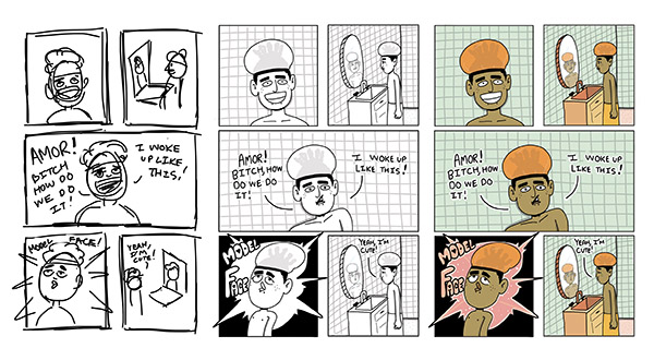
Page 6 we meet Amor by themself. Again I went back in and added their hair underneath the shower cap. For their hair, since they have dreads going on, I imagined they would need to tie their hair up and that’s what you see under the shower cap. On this page is also the first time we see a super cartoony version of a character. Something I do through out the entire book after this point. This is again a page that is pretty much exactly the same as the rough. Except in the last panel, I corrected the the perspective to have Amor and the mirror face the the same way.
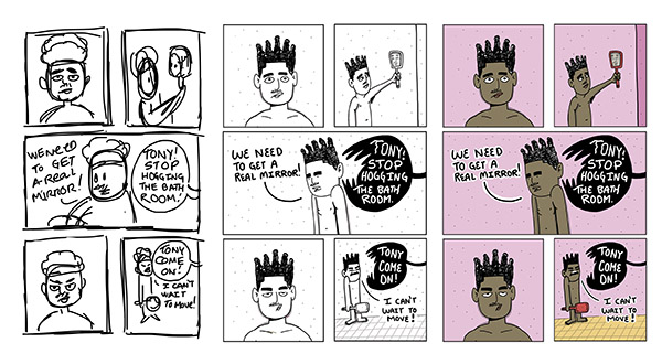
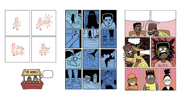
Page 7 we meet Tony. Tony is the only character not wearing a shower cap. In the original rough, he was wearing one. I decided to change it because on page 4 in Tony’s bathroom scene he is washing up in the sinks, so he wouldn’t need a shower cap because he has no shower. This page is also the first time we get to see the word balloons become their own characters. Something I continue throughout the book. I wanted it to really feel like what is being said to him has some teeth to it and in this case literally.
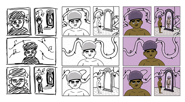
Page 8 we meet Lala. Her introduction is the only one that is wordless. Not silent though. It’s filled with music that guides you to each panel. Originally I was gonna add in lyrics, but I want people to imagine what she might be listening too. Also, because she is not speaking nor being spoken to, I needed a way to introduce her name, so I had it be on her full size mirror. In the rough, it originally said Empress Lala, but I decided to just stick with her name only. I added her hair afterwards too under the shower cap. Her hair under the shower cap is the closest to how my sisters’ looked.
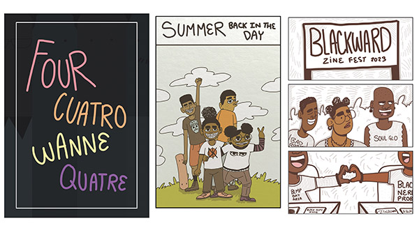
Each chapter of the book starts with a title page. The title of the page is written in 4 languages. English, Spanish, Swahili and French. Each one is colored to match the character’s specific color (almost like the Power Rangers, which I am a huge fan of. Lol). The idea behind this was to use languages that represent both the characters, Black people from the diaspora and myself. English, because that is my first language and the one Lika uses most often. Spanish because Amor is Afrolatine, but also a large number of Black folks from the diaspora speak Spanish. Also, I studied Spanish in school as my 2nd language, but I didn’t get very far with it, though I have to practice more because my spouse is Afrolatine and our kid is gonna speak English and Spanish. Swahili because I imagined Tony learned it because of his interest in Pan Africanism; I grew up learning Swahili words for Black History Month and at church. Also, this is the only language in the title pages that is not a language forced on Black folks because of colonization.
And finally French for Lala. One because of her being a Goth and I always grew up associating French with both love and death so it was a kinda poetic choice (I guess. I can see the eye rolls now, lol), but also, I studied French during college, just like Spanish I never stuck with it. So many Black folks in the diaspora speak French, because of colonization, but none the less it’s very much a huge part of Black culture. I remember the first and only time I went to France, I couldn’t believe how many Black people I saw. But this was my thought process behind the title pages.
For all flashback scenes there is a kinda sepia thing going on. For that I took a picture of a piece of comic board, the kind you get when you get a bag and board from the comic shop and used it as the texture of the pages. Then I added warm colors. I really wanted the flashback scenes to stand out against the present day. I have always been a fan of that kinda thing in movies and cartoons/anime.
One of my favorite and pretty unique chapters is when you get to the actual Blackward Zine Fest. When you enter into the fest all of the color is removed from the pages except for the melanin in the characters. This chapter is about complete Black joy and I wanted to show that Black people matter and are the focus. I did a few pages rendered in full color and though they were beautiful(to me) they missed the point. To remove the color and have the focus only be on the people was a deliberate and intentional choice. I really hope that comes across when people read it, I am also curious if people will get it or if they will just think it’s a stylistic choice. Nothing in this book is based on aesthetic alone. Everything has a purpose and intention.
Here are 3 pages without dialogue that have some of my favorite cartooning and uses of comics language on them. As my editor told me, I really used all my tools and knowledge about making comics and cartooning to create Blackward. Every color, perspective, pose, facial expression and panels choice, has a specific meaning. There are also a lot of shoutouts and nods to my comics and zine community as well as Black people from all over. It was a joyful process to create this work, but it was also hard and I hope folks enjoy this Queer Black Ass book I created.
Blackward comes out officially on September 26th, but you can pre-order it today!
Article by Lawrence Lindell


