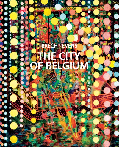
Brecht Evens must have had a more productive time under a state of lockdown than most of us, which is why we were lucky enough to be able to review his latest work, The City of Belgium, earlier this month. His style is as instantly recognisable as ever, but there is an undeniable maturity and lightness of touch that makes itself felt in panels that analyse everything from isolation and social anxiety to the human condition.
We had a few questions for him about his approach to colour, the long shadow of Hergé that is often cast upon his shoulders, and what he hopes readers take away from his books. Here are his responses:
BROKEN FRONTIER: You made a surprising admission a few years ago, when you said you first struggled with using colour. Now, it seems as if you understand how it works better than most other artists. Did something click, internally, that allowed you to finally move beyond black and white?
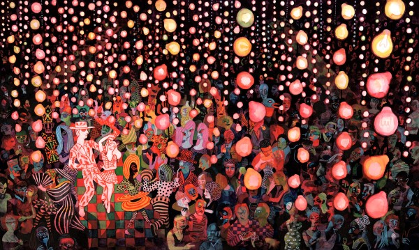
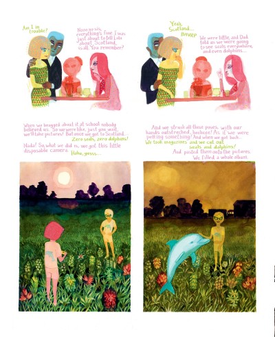
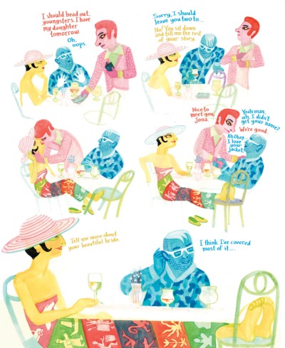
BRECHT EVENS: I always used a lot of colour, it was just that I was ‘colouring in’ line drawings, with bad results, instead of painting in direct colour surfaces and then detailing, even adding some contours sometimes. Painting in colour surfaces directly makes it easier to sense what contrasts you need. I may be wrong but I think colour is all about contrast (or lack of it), more than about the specific colours you choose. Art school teachers made me see that surfaces and lines are free and separate elements, that can have a colour, a texture, a surprising function, or be useless (adding no information). Lines are just another thin, long surface, at least in the way I use them now. The eureka moment came after following a suggestion by my colleague and friend Randall Casaer, which was to take a big brush and start a rough drawing with two main contrasting colours (red and blue), then detailing inside that beautiful mess. It automatically suggested using some tricks I picked up by doing silkscreens, where you have to think in color layers and plan ahead a bit.
BF: Why do characters from some of your earlier books make an appearance in The City of Belgium? What do you hope readers take away from these cameos?
EVENS: It is narratively unimportant but I think it helps create the sense that there is a lot of stuff going on outside of the story we’re following. I think it suggests we are in a real big city full of life, not a poor, simple paper version of one.
BF: Belgium has somehow managed to escape from the scrutiny that other major countries have had to deal with, in terms of unpleasant aspects of its history. Does this have an influence in how you portray it in your work?
EVENS: We still have statues of King Leopold II, who rivals or surpasses Hitler in how many people from another race he killed and mutilated with the help of his Belgian colonists. Even in his day Belgians were notorious for their awful ‘stewardship’ of the Congo. We should at the very least have a big official statue melting/crushing party on the Grand Place in Brussels, the sooner the better.
But colonial history does not have any explicit influence on my book, which shows a pan-European Frankenstein city, sown together from parts of every city I’ve loved, Brussels, Ghent, Paris, Berlin, Barcelona, perhaps even a splash of Istanbul.
BF: Your work is instantly recognizable to anyone who has read Panther or The Wrong Place, and I was wondering if you think about that consciously while staring at a blank page and beginning something new? Is there a conscious effort to break a mould?
EVENS: I don’t feel too stuck in a mould, but I try to break out of it when a scene in a new book needs another method of showing things. But when the old method does the trick it would seem forced to chase change for change’s sake.
BF: There is a strong psychedelic streak that runs through your panels, and a lot of us now associate that with a throwback to times that seemed simpler, less stressful than the world we live in. Do you find a sense of comfort there too?
EVENS: The psychedelism in my books is not inspired by the ’60s, but more of a way of showing real experience, movement and, less often, someone having an actual psychedelic trip), inspired at various points by German expressionists, cubism (from Picasso to Hockney), Escher, Ever Meulen, Charles Burchfield… There is no nostalgia intended, just current beauty, horror or feverishness.
BF: You once painted Tintin for a Flemish daily. Any biographical note about you describes you as a Belgian illustrator, with the inadvertent reference to Hergé thrown in for good measure. How do you evaluate his work and influence?
EVENS: Tintin books are beautiful and pleasurable. Hergé’s clear-line drawings work perfectly for comic pages stuffed full of action: a clear line helps us understand that Captain Haddock trips over a bucket, tumbles down stairs, into a basement full of brooms and vacuum cleaners. They also work wonderfully for drawing amazing machines in the Tintin moon-landing adventures.
Maybe the rule of thumb is that when drawing something crazy or particularly complicated, it needs to be drawn precisely, and when drawing something very everyday, such as people yapping about their lives in a bar, a touch of psychedelism and painterly magic is welcome.
Celebrated Belgian Illustrator Ever Meulen is a celebrated Hergé-descendent and an interesting case: a clear-line artist who draws impossible spaces and toys with how our eyes interpret drawings. Clean, tidy and very trippy.
BF: Does working in a non-native language impinge upon how you approach the creation of a visual or panel in any way?
EVENS: I don’t think it influences anything visual, but I’m sure that the dialogues have a different taste depending on which language I first wrote them in; my shaky conversational French, my slightly wooden and archaic native Dutch or my geeky English (one part Dungeons & Dragons manuals, one part New Yorker magazine, one part getting it wrong).
Buy The City of Belgium online here
Interview by Lindsay Pereira







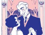
[…] lack of it), more than about the specific colours you choose.”—Brecht Evens, interviewed in Broken Frontier in […]