One of the things we enjoy most at Broken Frontier is following the development of exciting new talents. One such creator is Conor Stechschulte, who came to wider attention in 2014 when Fantagraphics reprinted his dense and powerful self-published comic The Amateurs.
Then, early last year, the London-based Breakdown Press produced the first part of his next major work, Generous Bosom, in a exquisite edition that demonstrated his gift for exploiting the potential of the comics form.
With the second part of Generous Bosom having been released at the end of 2015, Conor kindly took the time to talk to us about his background and development, the wonders of risography and falling in love with not one but three Englishmen…
BROKEN FRONTIER: First off, can you give us a bit of general biography? What was your upbringing like?
CONOR: I grew up in rural central Pennsylvania in a small college town surrounded by farmland. I spent my senior year of high school at an arts academy in northern Michigan, then I moved to Baltimore to attend the Maryland Institute College of Art. I got a BFA in painting (with a concentration in printmaking) there, then stuck around town for seven years after graduating.
During that time I drew comics, played in the band Witch Hat, and helped to found and run the Open Space gallery. I made money working as a museum security guard and a cheesemonger. Last year I moved here to Chicago to start a master’s program in print media at the School of the Art Institute of Chicago.
What were your early experiences with comics? When did you first start thinking of doing your own?
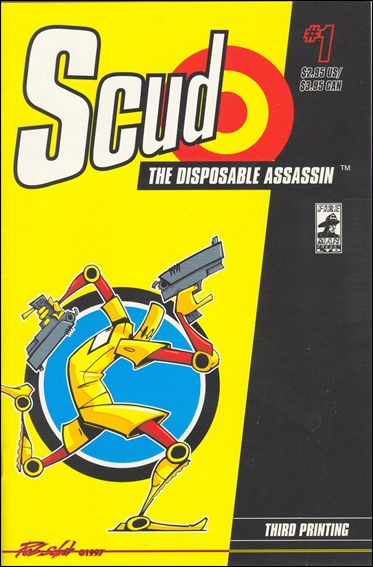 I was super into comics in middle school. I had a subscription to Wizard magazine and was reading Gen 13, Scud, Bone, and that sort of stuff. I tried to draw my own comics then and later on in high school but could never quite get it off the ground.
When I got to MICA, I met up with a bunch of people who were sort of in the same boat as me. We’d read a lot of comics and maybe even attempted them a bit but hadn’t had much success, and we all started talking about making comics together.
Among those friends were Ryan Cecil Smith and Mollie Goldstrom, who had made their own minicomics before, so they knew the ropes a bit and knew more about what was going on. Ryan introduced us all to a lot of mini comics and zines and suddenly this comics thing felt like it was within reach.
This was right at the time Kramer’s Ergot 4 and 5 came out and Picturebox was just starting, and we were reading all the comics on the old Fort Thunder website and we all got excited about this idea of really visually driven comics.
We put out the first issue of Closed Caption Comics at the end of our freshman year, and that was one of the most ecstatic experiences I’d had in art up to that point. From then on I’ve been hooked.
I first came across your work in The Amateurs. What else were you doing around that time?
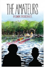 Lifewise, I was living above an art gallery in an operating auto-body shop and working as a museum security guard. Comicswise, CCC was coming to an end and I was looking to do something more ambitious on my own.
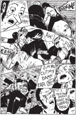
I’d just done a really long sketchbook comic while standing in the galleries at work. With that comic I’d worked out some of the formal stuff I got into with The Amateurs, like the panel borders and arrangement mimicking the motion of the action on the page. Doing that comic also gave me the confidence to undertake something longer… though I originally thought The Amateurs would be a 32-page floppy.
How did it come to be published by Fantagraphics?
I originally did a self-published risograph version of the book that Jason T. Miles picked up for his distro, Profanity Hill. He was working as the print buyer (I’m pretty sure) at Fanta at the time and brought the book to the attention of Eric Reynolds, who decided to take it on. I am eternally grateful!
The Amateurs has a very strong sense of place – that almost pagan feeling you get in some parts of the countryside. Are you familiar with that kind of rural environment?
 Definitely. The area around where I grew up is a lot like that. I also had a lot of profoundly affecting sylvanian experiences going to summer camp as a kid. My work keeps coming back to the idea/image of the woods.
When I reviewed The Amateurs, I described it as “something akin to the most transgressively nightmarish Laurel and Hardy film you’ve never seen”. Was that a conscious influence, even if just visually?
I really like that description, it feels right on to me. I was very attracted to the elemental image of the fat guy/thin guy duo. It was a natural choice, since I was thinking of the book as a slapstick comedy.
One stylistic point I noticed was the lack of gutters between panels on your pages. To me, that creates a real sense of claustrophobia, leaving the reader no opportunity to look away or take a pause. How deliberate a choice was that?
It started as an unconscious thing. I like the look of a really densely paneled page and gutters always feel like wasted space to me. I always want the narrative to have a propulsive momentum even during quiet moments, so hopefully this claustrophobic effect goes towards achieving that.
The Amateurs has a lack of clear resolution at the end, while Generous Bosom is asking more questions than it’s answering at the moment. Is something you respond to in narrative?
For sure. Most of my favorite art has a strong sense of the uncanny. The very act of reading comics involves the reader filling in the causes for represented effects, which is a big reason why I think it’s a medium uniquely suited for telling the kind of stories I’m interested in.
The stuff I want to get at, like desire or a kind of elemental fear or anxiety, are only diminished through trying to explain them. In fact, once you start explaining them you sort of aren’t even talking about them anymore. That said, I don’t want the reading of my work to feel trivial or obtuse. Trying to balance those things is the whole game for me right now, I think. Wish me luck.
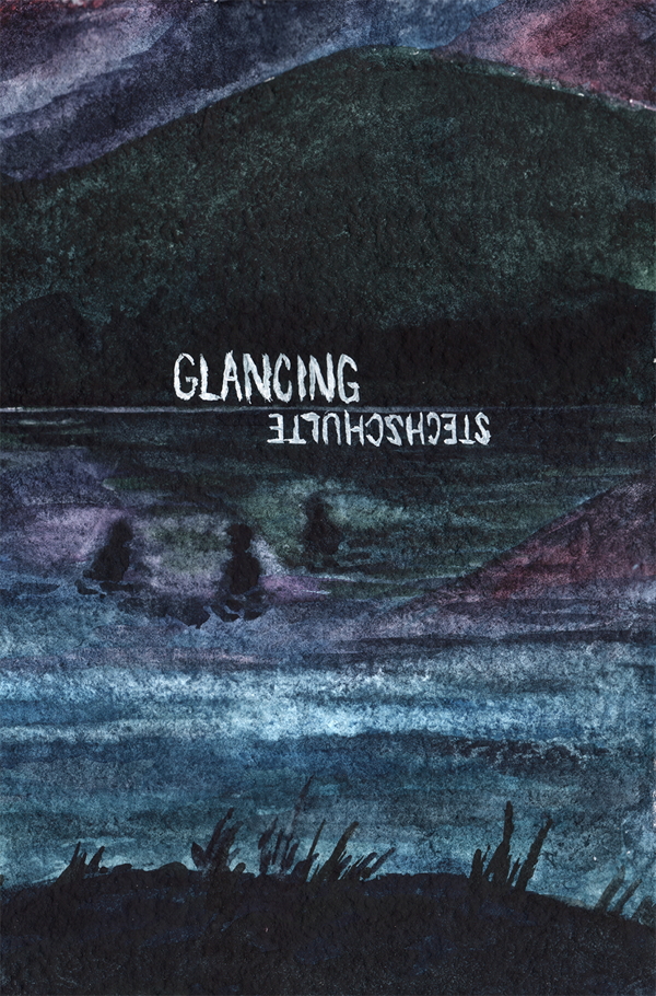 Your mini-comic Glancing was very different in style and format. What was the inspiration behind it?
Once I finished The Amateurs and was back at the drawing board trying to come up with new ideas, it felt like the generative side of my brain had atrophied a bit. So I realized while working on long projects, I’d have to build generative activities into my practice, like making paintings and experimental zines.
I’d finished Generous Bosom #1 at that point and had been making the 5″ x 7” watercolors for a little over a year and wanted to see if I could make a story with them. I made the whole thing very intuitively, starting with a couple of landscape images and then building out from there. Because the panels weren’t fixed on a page, I was able to move forward and backward in time, rearrange things, and play with the sequence all very freely.
I was also looking at a lot books from Fremok at the time, and was responding pretty directly to Yvan Alagbé’s work.
Around that time you posted a lot of paintings in that style, and sent them out as gifts with the zine. What did you find so stimulating about the style?
The immediacy is what makes them fun. I make them in bulk, usually laying out 3-10 of them at a time and working on them all at once. Right now, I probably have about 30 of them in progress. Their small size is liberating and allows me to sell them for about the price of a book, which appeals to me.
Is that something you do – a sudden burst of enthusiasm for a new medium or style?
I guess I do… Whenever I get asked to be in an anthology or want to make a new zine for a festival I try to take it as a chance to experiment. Though you get tied down to “Style” or a mode of working with long projects, I think it’s a drag to always draw the same way.
I’m sure I read somewhere that you started Generous Bosom before The Amateurs. Is that true? I was as bit surprised; Generous Bosom seems more ambitious and a bit more visually/narratively developed.
It’s not true – you’ve been lied to, Tom! I started working on Generous Bosom about six months after putting out the self-published version of The Amateurs. I took a pause in completing the first volume of GB to rework some parts of The Amateurs for the Fantagraphics version, so maybe that’s where the confusion came from…
Let’s move on to Breakdown Press. How did you end up working with a bunch of weirdos from London?
I’d met Joe Kessler and Simon Hacking at festivals a couple of times and fell in love with them (I came to love Tom Oldham at a later date). We were right on the same page with what we were psyched about in comics, and when they started putting out books, I was in heaven. It felt like they were building something really beautiful and I was eager to be a part of it.
The risographed production of Generous Bosom is very important. Had you worked in that format before? And how important was it in your creative choices?
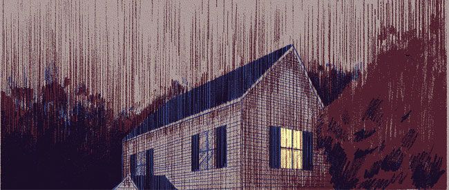
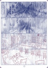 I’d risographed that original run of The Amateurs and a couple other books, but I started GB without knowing exactly how it’d be printed. Once I talked with Breakdown about putting it out and I knew it’d be riso, it actually solved a bunch of formal problems I was having with how to insert the contradictory narration and the “flashback” sequences in a way that wasn’t confusing. The overlapping imagery that’s possible with riso has become a pretty central aspect of the storytelling at this point.
I’d also say that seeing the first Windowpane was a masterclass in risography for me. It really opened my eyes to the possibilities available.
For a book with such a strong print identity, was it problematic working at such a distance from the printer?
It probably would have been without Joe acting as intermediary between me and the printers. That said, it’s always a bit nerve-wracking in the time between sending off the files and seeing the printed book.
In terms of plotting, Generous Bosom goes off into some oblique, seemingly perplexing directions – especially in Book Two. Do you always know where things are going? Have you got GB plotted out?
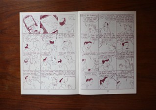 I’ve definitely got a plan but I’m trying not to work out too much ahead of time to keep things interesting for myself. I make an outline, then I plan things concretely in chunks of about 10 pages. I’ve been making notes on where the story would end up in the third volume since the very beginning. I’ve mostly got to build connective tissue at this point.
With up to 25 panels per page, the pacing of your comics seems very carefully laid out. Do you plan it out carefully?
When I get down to planning the pages, I do work a good deal on it. I think a lot about timing and focus, especially on where the page turns fall. I write out dialog, then thumbnail pages, then do a “Scratch” version of the full-size page, then lightbox the finished drawing from there, and I’m making changes at every stage.
(For more on Conor’s creative process, check out this great in-depth post on the Breakdown Press blog)
The first book of Generous Bosom contains one of the most remarkable sex scenes I’ve read in a while. Apart from the content, it looks very individual. How did you create that look?
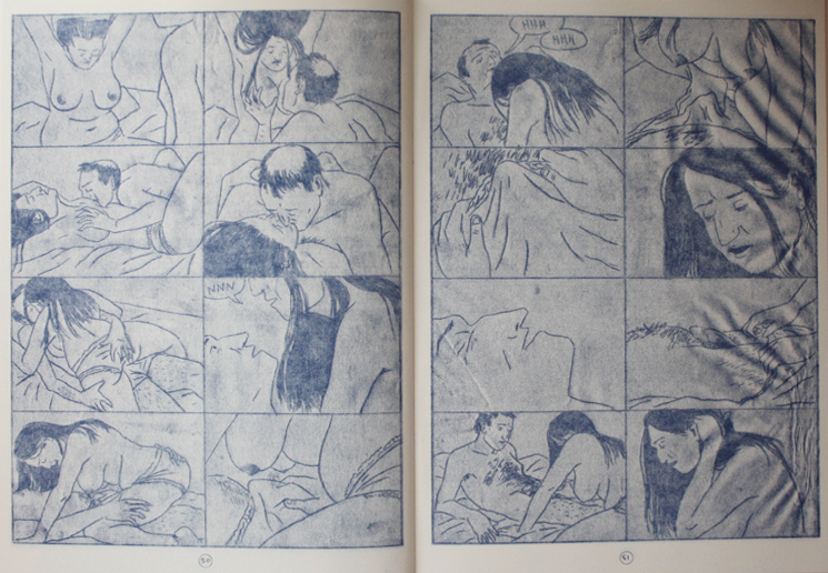 I got that effect by scanning the backside of the drawings and then adjusting the light levels until the image comes through. I came upon it accidentally while scanning some of my pages for Sock, an erotic anthology I edited, and I liked the way it looked. It felt evocative to me of being in a libidinous haze.
Some of the original drawings actually got wet from when I left the portfolio of drawings on a windowsill. That’s why one of the pages has a wrinkly edge, which I really like.
How much more of Generous Bosom is there to come?
There is, as I see it now, at least another volume’s worth (70 or so pages) and probably a little bit more. There’s a lot of ideas I’ve built up for the last part of the story, and then I’ve got to end the thing, so I’ll probably need some room to pull that trick off…
And what’s next for Conor Stechschulte?
More books! I’m working on a book of short things that I’m trying to produce pretty quickly. And soon I’ll get to work on the third volume of GB.
I’m in graduate school right now, so I’m trying use the opportunity to get weird and try out some new ways of working. I made a short animation last semester that I got pretty excited about… We’ll see, I guess!
Conor’s work is available via his website.





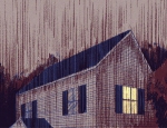


[…] from his years studying art at MICA with the Closed Captioned Comics crew to present day. Read all the nitty gritty here. [and you can pick up Generous Bosom 1 and 2 at the Breakdown Press online store […]
Great interview but this is why I liked adding names or Q; and A; at the start of q’s and a’s. Or else it’s jsut like a Cormac McCarthy novel. MAybe mre appropriate.