It’s time for another mini-season of our ‘Covers Album’ feature where we ask comics creators, publishers and commentators to pick three of their favourite comic covers… but with a small twist. One must be chosen for aesthetic reasons, one for inspirational reasons and one for pure nostalgia! Today’s guest is François Vigneault, the American-born cartoonist who lives in Montréal, Québec. A timely appearance as the first collected volume of the Orcs in Space series he illustrates was published last week.
François’ sci-fi graphic novel Titan (Oni Press, 2020) was originally published in French by Éditions Pow Pow in 2017 and has been called ‘a smart, stylish political sci-fi romance thriller’ by the Comics Journal. Titan has been nominated for multiple prizes, including the Prix Des Libraries Québec and the Joe Shuster Award for Best Cartoonist. His newest project is illustrating the aforementioned comic book series Orcs in Space, co-created and written by Justin Roiland, Abed Gheith, Rashad Gheith, and Michael Tanner, with colors by DJ Chavis and Travis Pender.
He is also the co-creator of 13e Avenue , a YA comic book series created with Geneviève Pettersen and published by Éditions de la Pastèque. The first volume won the inaugural Prix Des Libraries Québec award for best youth graphic novel, along with prizes at the Trois Rivieres and Saguenay-Lac-Saint-Jean Book Festivals, and has been nominated for many others, including the Prix des Collèges at the 2020 Angoulême Comics Festival.
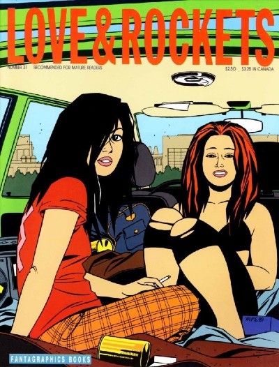
Inspirational: Love & Rockets #31 (1989) by Jaime Hernandez (Fantagraphics Book)
I was just out of high school when my friend (and brilliant cartoonist) Jonas Madden-Connor thrust an issue of Love & Rockets into my hands and said “You’re gonna love this.” Obviously, he was right. Jaime Hernandez looms large in my personal pantheon of comic book artists, in fact you could probably safely say he’s right at the top. The combination of Jaime’s multi-ethnic, Southern California punk rock subject matter and his super-clean, fifties-style drawing aesthetic was a match made in heaven for me. I ended up writing my thesis on Jaime’s work and I pored over every panel, page, and cover of the Locas saga.
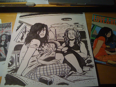
I could easily pick any of a dozen iconic Love & Rockets covers for this (check out this earlier Covers Album post to read Ricky Miller’s appreciation of what is in my mind the ne plus ultra of Jaime covers and comic book covers, period, L&R #24), but I often find myself coming back to this quiet portrait of Hopey and Maggie on the road. This simple image does so many of the things I’m attempting to do with my own art (but so much better than I can do myself, naturally!). There is a fantastic tension in this image that’s reminiscent of great portraiture in painting and photography, I’m simultaneously pulled in by this image and have the impression that I am trespassing, an unwelcome interloper in a self-contained world. The image combines a sort of pure simplicity of line and form (the black spotting in Hopey’s hair and Maggie’s clothes is perfection) with a ton of subtle details (the fold of skin on Hopey’s elbow, the casually held cigarette, the trash cluttering the backseat of the car) that make the scene feel completely lived-in and authentic. It’s a window into a fictional world that I can’t help but want to find out more about.
That is the kind of feeling I’d really like to achieve in my own work, and though I happily don’t hold myself up to the high bar Jaime is setting here, there is still a ton for me to learn in his work. In fact, I did a study of this particular image nearly ten years ago that ran on the late, great Covered blog, and for any artist who is trying to learn the tricks of the trade I’d highly recommend this sort of exercise.
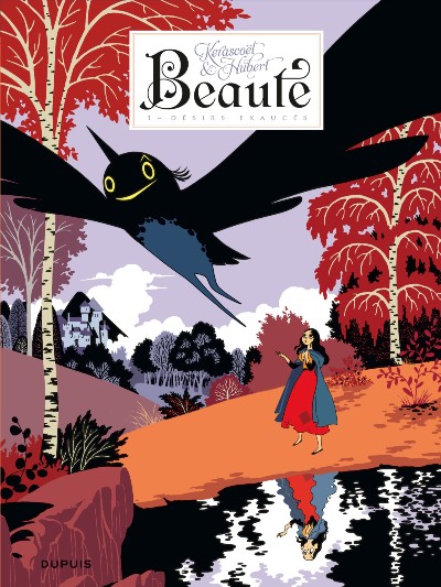
Aesthetic Choice: Beaute Book One (2011) by Kerascoët (Dupuis)
To me this cover by the artist duo Kerascoët (Marie Pommepuy and Sébastien Cosset) from the first volume in the original French series is doing so many things all at once. It is aesthetically gorgeous, with a subtle use of solid color blocking and minimal linework to convey a surprisingly immersive sense of depth to the picture plane: The black, nearly abstract fairy Mab flies out at the viewer and dominates the top half of the image, pointing back at the figure of Beauty on the shoreline. Along with her reflection in the wavy water below, this tiny figure is the only “traditionally” drawn element of the cover, with thin, elegant black outlines picking the figure out. The background demonstrates the creators’ total mastery of the form, balancing naturalist details (the delicate branches and leaves) with a willingness to virtually eliminate shading and modeling, reducing the entire landscape to a series of solid blocks of color in a style that brings to mind classic printmaking techniques. While the image is superficially very simple, there is actually so much careful planning going into the piece.
But what I find the most impressive about this cover is the way all these aesthetic elements are working to give subtle clues and hints about the narrative of the book. The overwhelming apparent size of the tiny fairy Mab hints at the outsized effect the character has on the narrative. Beauty’s reflection in the pond might at first glance seem to be just a distorted mirror image, but a closer look reveals that the image actually shows the character’s true form, the physically unlovely Morue. Almost nothing about the story is revealed here, but the image is instantly arresting, and further rewards repeated viewing and gains narrative heft as the reader comes to understand the story. To me that is one of the things I most appreciate in a cover design and something I am always aspiring to in my own work (though I certainly don’t achieve results like this!). It also helps that Beaute is a masterwork from both an artistic and writing point of view, a perfect match-up of Kerascoët’s visual virtuosity and Hubert’s twisted and complex fairy tale narrative.
The really wild thing is that Kerascoët can really do it all; I might have easily picked any of the various covers and editions of Beaute (like the insanely detailed cover to volume 3, where a naked Beauty descends a staircase into a hellscape of demonic faces), or one of their other projects (click here to read Rebecca Burke’s thoughts on the gorgeous watercolor cover to Beautiful Darkness in another installment of Covers Album). I guess in a way it’s not fair, Kerascoët is after all a collaborative enterprise of the artists Marie Pommepuy and Sébastien Cosset. Even though their visual style (or perhaps styles plural is a better descriptor) isn’t very close to my own work, I am always going back to their work and I’m consistently blown away.
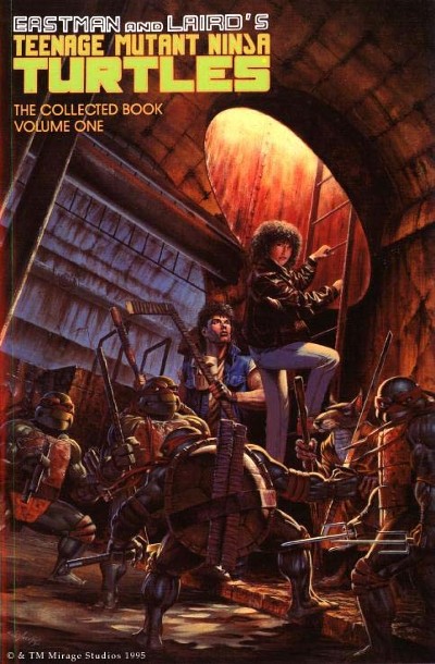
Pure Nostalgia: Teenage Mutant Ninja Turtles: The Collected Book Volume One (1990) by A.C. Farley (Mirage Studios)
At the tender age of 12, this massive (500+ pages!) tome collecting the early issues of Kevin Eastman and Peter Laird’s seminal comics series was my absolute prize possession. Though I had read newspaper strips and occasional comic books when I was younger, it was TMNT that really brought me into the wild and woolly world of comic books. My love of the animated TV show and action figures led me to visit a comics shop seeking out the cartoony Teenage Mutant Ninja Turtles Adventures comic series, which brought the cartoon’s goofy, family-friendly vibe to the page, but I soon found myself intrigued: Evidently there was another TMNT comic out there, the mysterious original series. This massive collection with its painted cover by A.C. Farley was my deep-dive into Eastman and Laird’s creation, which couldn’t have been further away from the kid-friendly Turtles I knew: Everything from the raw black and white artwork to the far more mature themes to be found in these pages made an incredible impression on me… TMNT led me not just to a ton of other more “indie” comics (and the early 1990s were a fantastic time to be getting into comics, I quickly moved from TMNT to series like Stan Sakai’s Usagi Yojimbo, BONE by Jeff Smith, THB by Paul Pope, Daniel Clowes’ Eightball, Julie Doucet’s Dirty Plotte, and so many more), but also to the idea that comics were something I could pursue on my own terms: The story of Eastman and Laird’s remarkable up-by-their-bootstraps self-publishing story planted the idea in my head that anyone, even a weird nerdy kid like me, could use this artform to express their own stories.
As for the cover art itself, I remember staring at this painting by A.C. Farley, just drinking in all the details, from the Turtles oddly geometric bodies to the tilted perspective to the fourth-wall-breaking stares of the characters looking back out of the picture plane. I thought it was so strange to see these familiar characters interpreted in a realistic style that was so different from the art on the inside of the book. There is a strange aesthetic friction there, which in many ways I find a bit discomforting, as a rule I tend to like it when the cover art is by the same creator as the interior, but there is something to be said for the spirit of collaboration and interaction you get by seeing other creators tackling the same material. I hadn’t really followed Farley’s career, in addition to a ton of work for Mirage Studios during the TMNT heyday his paintings were all over the place in the world of science-fiction and fantasy art. Well worth checking out his portfolio!
Read the full ‘Covers Album’ back catalogue here. If you’re a comics creator, organiser, commentator or publisher and you’d like to take part in Covers Album contact us by e-mail here.


