In ‘Covers Album’ we ask comics creators, publishers and commentators to pick three of their favourite comic covers …but with a small twist. One must be chosen for aesthetic reasons, one for inspirational reasons and one for pure nostalgia!
This week we have three picks by Joe Decie, that master of fantastical autobio work. Joe’s graphic novel Collecting Sticks was published by Jonathan Cape in 2017, he was previously published by Blank Slate Books and he has built up a vast back catalogue of self-published work including comics like Telepathy Practice. Most recently he contributed to the Colossive Cartographies series. You can read an interview with Joe (and family!) here at BF.
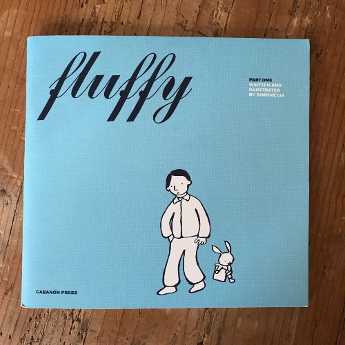
Inspirational choice: Fluffy (2003) by Simone Lia (Cabanon Press) Cover design by Billy Kiosoglou of Brighten The Corners
Manchester, 2003. A friend of mine buys a copy of Fluffy by Simone Lia from Magma, a lovely little book and magazine shop, the kind that sells obscure design magazines and silkscreened wrapping paper. We sit in the bar next door and read it, devour it. I love it. I pop back and pick up a copy for myself along with a tiny Tom Gauld comic. At the time Simone and Tom were self publishing under the name Cabanon Press and they were amongst the first indie comics I’d seen. In the ’90s I had a brief spell of buying comics, digging through long boxes. But the comic shops I’d visited were full of middle aged men arguing with small boys, judging you harshly on your purchases. I knew I would have to work hard to impress these people, so instead I just never went back. But this was different, these books Simone and Tom were putting out had a design aesthetic that fit perfectly with the trendy little boutiques, bookshops and galleries that stocked them. Stripped back colour pallet, uncluttered cover with beautiful flat bold drawing and well considered prominent type setting, classic design of the early ’00s. Perhaps they were responsible for widening the audience of comic readership here in the UK beyond that of the comic shop regulars? I think so. They inspired me to start looking at alternative and indie publishers. And although it was a few years before I’d start drawing my own, the seed was planted.
Fluffy is a gentle story of a bunny experiencing an identity crisis. It’s also about parenthood, childhood, dating, all sorts of things. It’s really great.
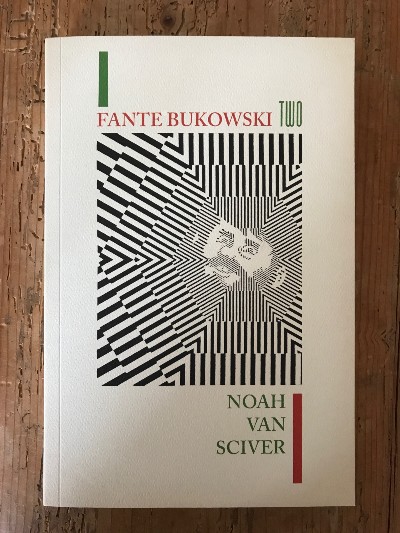
Aesthetic choice: Fante Bukowski Two (2017) by Noah Van Sciver (Fantagraphics) Cover design by Keeli McCarthy
I love this cover, it’s a genius bit of design. A perfect parody of Charles Bukowski and John Fante’s books published by Black Sparrow Press (the incompetent poet protagonist of Noah’s comic sets out to make himself a kind of modern day version of these writers, with hilarious consequence). Noah is a brilliant cartoonist but for the purpose of this piece the props must all go to Keeli McCarthy, designer for Fantagraphics. It’s not just the cover image, it’s the whole package, the small details. The paper-stock choice, fake removed sticker residue on the back cover alongside a Borders bookshop-esque barcode, fake penciled in price on the inside cover. Details that make it really seem like a second-hand Black Sparrow book, maybe one you picked up in a used bookstore in San Francisco. So clever, such a joy to see.
I don’t often see book designers in this field get mentioned, usually only when it’s a bad design choice, to get moaned about. And often cartoonists are left to design our own covers. This isn’t always a great idea, being able to draw and tell sequential stories is a million miles from choosing a single image to represent a whole story. Plus there’s design considerations, font choices. In the hands of a good designer a book just sings. Do look at Keeli’s other work for Fantagraphics, some really lovely books.
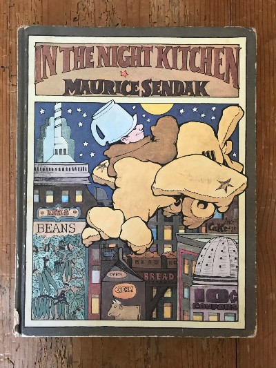
Nostalgic choice: In The Night Kitchen (1970) by Maurice Sendak (Bodley Head)
Childhood favourite of mine. I adore Sendak’s chunky clumpy style on this one and the muted, moonlit, night-time pallet. So very flat and beautiful. When I’ve talked about this book before, people have questioned whether it was a comic or not. I’m not sure why, it’s obviously a comic to me… panel boarders and captions and word balloons and sequential art equals comic, right? It wasn’t until I was an adult that I discovered Winsor McCay’s Little Nemo and also Dream of the Rarebit Fiend, on which this book obviously paid homage. So shout-out to McCay too.
Visit Joe Decie’s website here and store here.
Read the full ‘Covers Album’ back catalogue here. If you’re a comics creator, organiser, commentator or publisher and you’d like to take part in Covers Album contact us by e-mail here.


