In ‘Covers Album’ we ask comics creators, publishers and commentators to pick three of their favourite comic covers …but with a small twist. One must be chosen for aesthetic reasons, one for inspirational reasons and one for pure nostalgia!
This week we turn to Broken Frontier’s Rebecca Burke whose own powerful comics practice you should be following through her Instagram account…
Aesthetic choice: Stages of Rot (2019) by Linnea Sterte (Peow)
My aesthetic choice has to be Stages of Rot by Linnea Sterte, mostly because I adore Sterte’s delicate linework – an aesthetic style in its own right, in my humble opinion. Maybe I’m just a comic magpie, but the gold embossing of the title and the text box on this version of the cover definitely caught my eye when I was browsing the independent/small press comics section in Gosh! Comics (coincidently, completely unaware it would be my last venture there for quite a while).
I love the contrast between the murky green tones of the cover and the delicate, fragile linework of the cover illustration. Even the font reeks of finesse and charm, contrasting the very title of the book itself. How can rot be so beautiful? This motif is carried throughout the comic, and it seems to be one of Sterte’s ultimate aims: to show us that sometimes we just need to zoom in or out on a particular subject to rediscover the beauty of the thing itself. To be honest, that’s a mantra I would like to call upon more in my daily life.
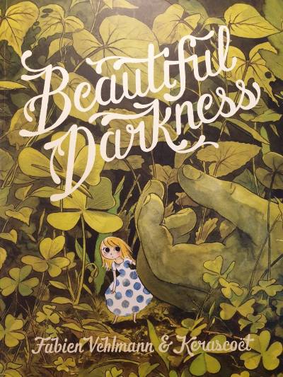
Inspirational choice: Beautiful Darkness (2014) by Kerascoët (Drawn & Quarterly)
The slow-burn of this cover is something that really appeals to me in cover art. I picked it up off the shelf because the greenery, which continues onto the spine, caught my eye. As a self-confessed nature-lover, the front cover did not disappoint. A cute little character too; how charming! What a wholesome book…
…and then you spot the hand. The grey, dirty hand. That does not look like a hand that belongs to someone in a present state of health and wellness. Not at all. The dichotomy of these elements, only reinforced further by the contradiction present in the title of the book, grabbed my attention straight away. As far as cover art goes, Beautiful Darkness does not give too much away but, instead, leaves you with questions that you cannot resist. Having not heard of this comic before, it was this cover that intrigued me and I couldn’t have left the bookshop that day without it.
Additionally, as someone who uses watercolour in my own comic work, this piece is inspirational to me because of the level of detail and skill in the paintwork. I aspire to reach this ability in my own comic meddlings some day.
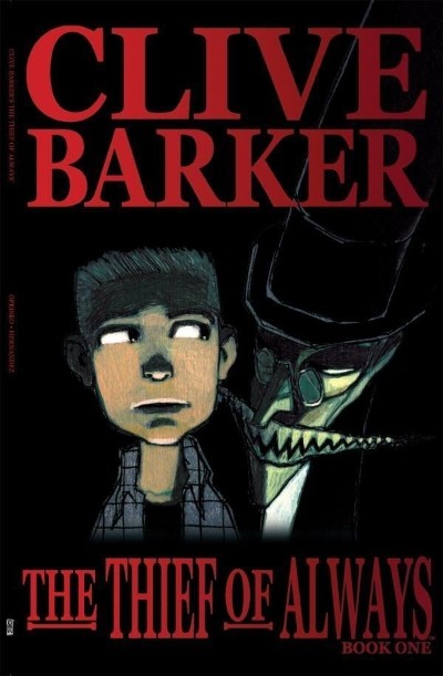
Nostalgic choice: The Thief of Always – Book One (2005) by Gabriel Hernández Walta (IDW Publishing)
So, when I first encountered this comic trilogy – an adaptation of Clive Barker’s novel by the same name – I was on a school trip to New York (one of those trips where the teachers could not even be bothered to pretend there was an educational component; they just wanted to offer those of us in our final year a good trip). I was in a bookshop in Soho, an innocent, unassuming non-comics reader at that time, who just wanted to read fantasy books. Then I found this, and I was intrigued by the mysterious figure on the cover. The toothy grin was unnerving and enticing at the same time.
Clive Barker’s The Thief of Always (adapted by Kris Oprisko) had everything I was passionate about as an angsty teenager – a child who discovers something quite out of the ordinary and gets propelled into some adventure that is bigger-than-them (on the precipice of leaving for university, this was definitely a biggie). It was my first time realising that comics extended beyond superheroes and manga, and I will be forever grateful to have stumbled across it.
Read the full ‘Covers Album’ back catalogue here. If you’re a comics creator, organiser, commentator or publisher and you’d like to take part in Covers Album contact us by e-mail here.


