 In ‘Covers Album’ each Wednesday we ask comics creators, publishers and commentators to pick three of their favourite comic covers …but with a small twist. One must be chosen for aesthetic reasons, one for inspirational reasons and one for pure nostalgia!
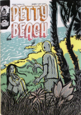
This time round we have the thoughts of the small press collective Backwards Burd‘s Sajan Rai. Sajan is the artist behind Petty Beach and Brocko N’ Frens through his own Childish Butt-Vomit imprint.
His current project is the Instagram-based Oh Hai Ku series which he describes as “illustrated Haikus to increase general stress and anxiety and reduce overall wellbeing.” You can see more here.
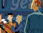
Aesthetic Choice: Orc Stain Volume 1 (2012) by James Stokoe (Image Comics)
Ever picked up a comic because its cover is beautiful, and been utterly DISMAYED at the interior contents? Orc Stain is pretty remarkable in that the psychotic amount of detail that’s gone into the cover actually carries on into and throughout the book. The entire thing was written/drawn/coloured/lettered by James Stokoe, and he’s done all of those fantastically.
I’ve bluntly said in the past that I hate gradient colouring. A more accurate elaboration would be to say I have an (again, general) abhorrence of a digital airbrushing style that continues to sully good drawings. Stokoe, however, uses linear gradients of a limited colour palette, applied to his meticulous cel-shading – and it looks great.
As a fantasy book, it’s pretty refreshing and inventive. Detail isn’t reserved for aesthetics alone, there are so many fascinating and hilarious concepts peppered throughout.
In short – a great comic that lives up to its cover.
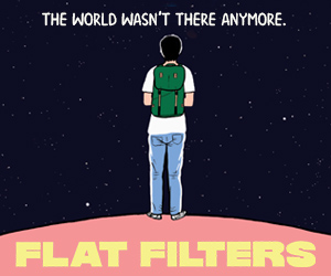
Inspirational Choice: Omipathy #1 (2011) by Joe Sparrow (Self-published)
Joe Sparrow’s probably the artist whose work I slam into people’s faces the most, and it continues to be very inspirational (he and Blanca Martinez have produced some mind-blowing work in a project called Dungeons and Drawings, and he also released some Tarot cards a few months ago).
I discovered his work from picking up Omnipathy – a series of 3, containing fascinating short stories. The covers are sequential art in themselves, which is fills me with additional joy. All I can hope is that he one day releases 250 hardback books – and that in the correct order their spines create a Bayeux Tapestry masterwork a-lá Mr.Men books.
Anyway, this cover features a very fine pixelation – it’s a signature trait that can be seen in a lot of his work, and that I’ve yet to see anyone hold a candle to his use of. That said, it doesn’t define his style. Brilliant colour choices, interesting shapes, angles, design, linework and shading.
Also, the cover kinda looks like a face. Huh.
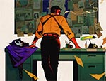
Nosstalgic Choice: The Far Side Gallery 1 (1989) by Gary Larson (Sphere)
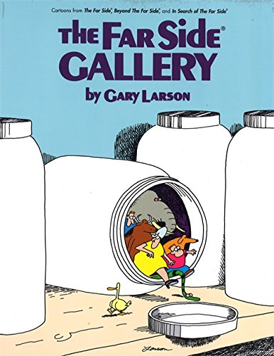
Illustrative cross-hatching ensures that it can’t be mistaken for sleek minimalism – 85% of this cover is just BLAND. Of course that makes it all the more delightful that some stock Gary Larson characters are sneaking out of from that off-centre oval. It’s just a weird image.
I think it really reflects the kind of stupidity and genius within the vast volume of Gary Larson’s mostly one-panel strips. Sure, he’s not renowned as a draftsman, but for comedic value, Gary Larson has a real knack for composition. It’s one of the many things that make his single panels hilarious and highlight the complete absurdity.
I think he’s had a profound impact on my work since I read this book as a kid. There’s something about making a snapshot of a moment as hilarious as possible that really appeals to me.
Honourable Mention to The Book of Hope by Tommi Musturi
The Book of Hope is the compilation of volumes by Finnish artist Tommi Musturi, available in English and many other languages. BUT instead I bought all these single volumes individually because I loved the covers. They were only in Finnish and I knew I wouldn’t be able to read them. I’m pretty sure he thought I was an actual moron.
You can follow Sajan Rai on Twitter here and visit his site here.


