 In ‘Covers Album’ each Wednesday we ask comics creators, publishers and commentators to pick three of their favourite comic covers …but with a small twist. One must be chosen for aesthetic reasons, one for inspirational reasons and one for pure nostalgia!
This week we’re joined by British indie comics star Hurk whose idiosyncratic comic stylings have been a signature part of the British small press scene for many years, whether that be in the pages of The Comix Reader or in publications like The Static Revolter, Bazoik and Affordable Amazement Catalogue from the Fancy Butcher Press collective he co-founded.
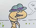
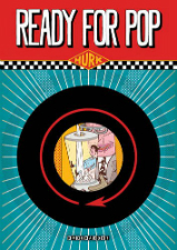
Last year his graphic novel Ready for Pop was published by Knockabout. Set in the ‘60s, it follows the misadventures of Detective Chief Inspector Ladyshoe and his Scotland Yard team as they investigate who used a shrink ray on pop sensation Vic Vox and seek to reverse his predicament before his headlining turn on Britain’s top music show. It’s as brilliantly bizarre as it sounds…
Aesthetic Choice: Stripburger #41 (2005) by Igor Hofbauer

Everything I’ve seen of Igor Hofbauer’s work I have loved but I don’t know too much about him. I know he is an illustrator from Zagreb and it was this issue of the excellent long-running, Slovenia-based international anthology Stripburger that introduced me to his work.
His style has the obvious aesthetic influences of B-movie sci-fi, film noir and Russian constructivism – the latter both in the style of lettering and also the architecture and industrial imagery he employs. But he is one hot drawer and, although his work may have these influences, it still appears to be totally unique and fresh.
Much of his work that I have seen tends to use a limited colour scheme that gives it a screen-printy feel, which may be to do with the fact he is a prolific poster artist. The few greens with the black and yellow really works on this cover (which looks to be something to do with Fritz Lang’s Dr. Mabuse films, though his story inside features an evil Andy Warhol lookalike).
It actually looks better to me in print than it does here as the colours appear slightly muted on the thick matte paper. Mmmmmm.
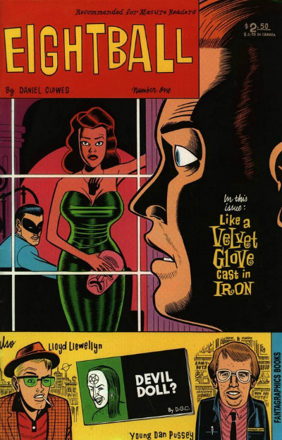
Inspirational Choice: Eightball #1 (1989) by Daniel Clowes (Fantagraphics)
The first dozen or so covers of Eightball are my favourites. The way Clowes divided them into boxes with separate images referencing the different stories inside is quite ‘busy’ compared to his covers these days which usually feature one big portrait, but they work perfectly.
In this first cover, the bottom box is roughly the same height as the title box at the top so that it frames the main central image. The red title box almost becomes the top of the window frame except it does not stretch the width of the cover so there is an interesting layering effect with the man’s head behind it and looking in at the window. The heavy black shadow on side of the man’s face providing a space for the ‘Velvet Glove’ title to pop out of… why am i just describing the elements of an image that you can look at here with your own eyes??? Nice colours too, eh?
Clowes is a great graphic designer and it is for this ‘complete package’ of design skill and drawing skill together (and interesting fiction, but we are just talking about covers here) that this is inspiring to me.
Nostalgic Choice: MAD #41 (#93 in US) (1964) by Norman Mingo
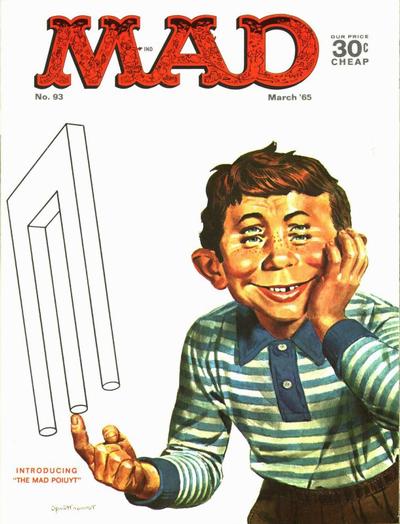
I first encountered Mad Magazine when I was about 10 and I thought “It’s not The Beano, it’s clever wise-cracking American shit for cool adults!” You know, like a paper Hawkeye from M*A*S*H, but funny. It felt fresh to me (the same feeling I had when I later discovered Crumb and the underground comix).
So a Mad cover is my perfect nostalgic choice and this one has a double dose of nostalgia for me – i used to try and draw those optical illusions all the time! Was it just me? Yep?!
Norman Mingo was the guy who drew/painted Alfred E. Neuman into the form that is so familiar to us today, and he became the main man for Mad covers throughout the Sixties and Seventies racking up 97 in his lifetime.
It was a clever idea to have a ‘mascot’ that featured on all of the covers and this ‘restriction’ on the cover artists to feature the gappy chap has given us (with the help of Kurtzman’s Mad title lettering) a super-coherent collection of comic-book (or magazine?) covers.
I could have picked any Mad cover but I am partial to these quite simple but clever compositions that perhaps would not work so well if the artist was not so skilled. This particular one was featured as part of a covers gallery in a book I had, called 25 Years of British Mad and my eyeballs almost wore the ink off the pages in the time I spent studying that book.
For more on Hurk’s work visit his website here and follow him on Twitter here. Ready for Pop can be ordered here from Knockabout priced £9.99.


