 Our Inside Look feature at Broken Frontier provides creators with the opportunity to share exclusive commentaries on their comics projects with our readers, giving insights into the genesis, process and themes of their work. It’s one of the oldest regular features at BF, first appearing on the site back in the mid-2000s, and although it’s been a little neglected in the last couple of years it returns today as a semi-regular feature again.
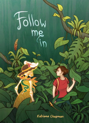
First up, we have double Broken Frontier Award-winning artist Katriona Chapman whose Katzine won Best Ongoing Series in 2017 and whose graphic memoir Follow Me In (published by Avery Hill) was the Best Graphic Non-Fiction winner for 2018. Follow Me In (reviewed here at Broken Frontier) is an autobiographical account of her post-university years and the life-changing trip to Mexico she took with her boyfriend Richard. It’s both a gorgeously illustrated travelogue and a candid account of her deteriorating relationship with a partner whose drinking had become out of control. We described it as “a beautiful, devastating and hauntingly fragile triumph” here at BF and if you’ve read it already you’ll know just how true that is.
Katriona talks in depth about the book below and there’s a link to the Avery Hill store to order the book online at the bottom of the page.
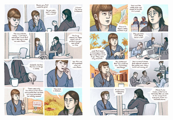
When I was writing Follow Me In, at one point I remember wondering if I should write an introduction to the book. I wanted a way of emphasising that the time period the book is set in is a good fifteen years ago, and that so much has changed in that time. An introduction would allow me to talk about the political changes in Mexico since 2003… how the drug violence we hear about now was nowhere near as prevalent back then. I also thought it would be worth bringing up the changes in technology since 2003… how this trip took place before we had smart phones, and was a very different experience for that reason than it would be if I went travelling in Mexico now.
But then it occurred to me that the introduction could be integrated into the comic, and would give me a chance to touch on all these things while also introducing the main characters and their relationship to one another. I’d always envisaged colour being really important to this book, to help show the differences between all the different locations I depict (and also as a way to evoke different moods and emotions.) It was obvious that this opening London scene would have the grey, muted colours of London. It was my editor Ricky Miller’s suggestion that in this scene the warmer colours of Mexico would start to creep in, as the characters talked about specific places and memories.
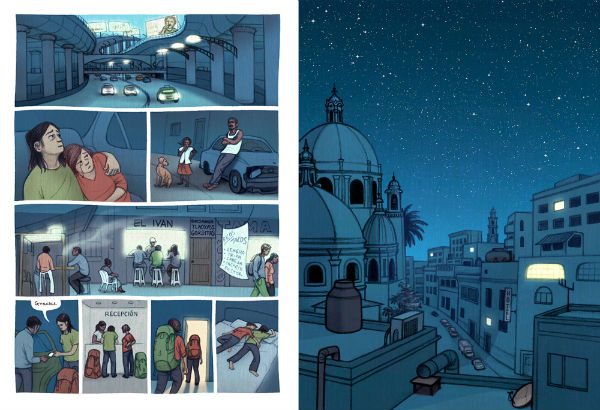
This page shows the taxi ride through Mexico City from the airport to the first hotel of the trip. We arrived fairly late at night, which always makes getting to a new place a little scary as everything’s dark and you only get fleeting glimpses of your new environment. I wanted to capture that feeling of glimpsing a new place in snapshots from a taxi window, while being kind of bleary and exhausted from the journey… the kind of heightened state you can be in from lack of sleep. I ended up really liking the wide panel with the people in the street… the steam and lights help suggest cooking smells and the bustling life of a busy city at night.
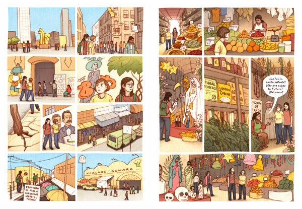
When I started the book, one of the things I was most excited to draw was the very first day in Mexico City. I wanted to try to suggest the culture shock of the first day in a new place; the unfamiliar plant-life, language and sounds. Kind of a sensory overload. The page before this one shows the Mexico City metro, the traffic and the noise. This page depicts a walk to the Sonora Market, a huge labyrinth of a market that has different areas selling goods including food, household goods, herbal medicine, magic and the occult.
There’s some foreshadowing on this page that was kind of unintentional but which I love! There’s a graffiti depiction of La Catrina, the skeleton character that has a role a little bit later in the book. And the fortune teller is asking my character if she wants to know her future… about love maybe. Which works really well as the book is about to show the future of my relationship at this point. I didn’t actually write this bit of dialogue – I asked my partner Sergio (who’s from Mexico City and provided me with a lot of the Spanish dialogue) what a fortune teller might say in this context. But once he suggested these few sentences, I realised it fit really perfectly with the story.
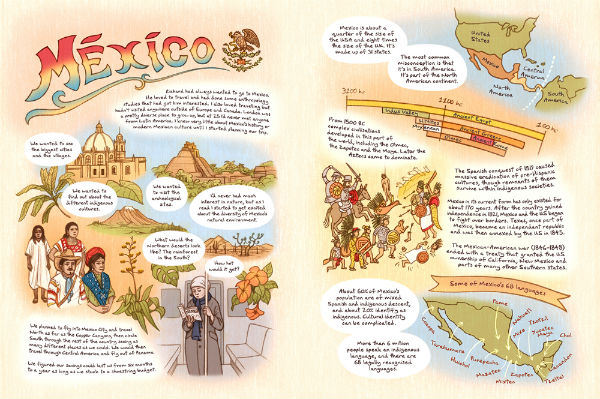
There are a number of pages in the book that are outside of the main narrative, and provide background information like this one. I enjoyed varying the layouts of these, and being able to use decorative lettering and things. For the lettering on these pages I took inspiration from things like Mexican sign-painting, street art or tattoo styles. You see a lot of amazing hand-painted signs on the streets in Mexico, and I definitely wanted to reference that. I also talked with Ricky about how to keep these pages interesting, considering they were going to be way more text-heavy than the comic pages. So that meant breaking up the text into small chunks, making sure it was balanced with enough illustration, and keeping the tone conversational and personal rather than dry. I always enjoyed laying out these pages where there were no panels and they could be really fluid and varied.
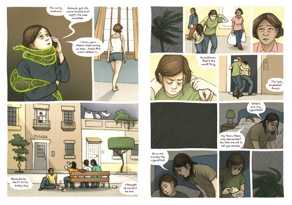
This is an example of using colour to evoke mood. I ended up being really happy with the colours of this page, where I think the kind of queasy shades of green give a feeling of unease. The dark sky and suggestions of wind also help underscore the theme of emotional turmoil. With a lot of the book having bright, warm & sunny colours, it worked really well to use pages like this as a counterpoint where the story becomes more dark and heavy. I really enjoyed designing different colour schemes for different parts of the book according to the type of landscape, climate or emotional state of the characters… making each colour palette both harmonious within itself but also different to what’s come before.
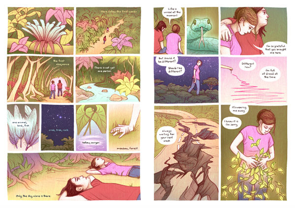
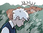
My illustration style and approach to colour is usually fairly realistic, so this scene with magic mushrooms in a jungle setting was an opportunity for me to step outside of that. At this point in the book there have already been quite a number of pages with jungle scenery, so it was great to be able to vary the colour scheme away from just shades of green. The characters being in an altered state also kind of allows them to step outside their usual behaviours and say things that they might not normally say. It was fun thinking of imagery that might represent the characters’ inner lives but also relate to the physical place where they find themselves. Just before this section in the book I talk about how the characters become obsessed with the rainforest, and this section allowed me to really enjoy trying to convey that sense of amazement in different ways.
For more on Katriona Chapman’s work visit her site and store here and follow her on Twitter here. You can order Follow Me In from Avery Hill Publishing here.
Feature by Katriona Chapman


