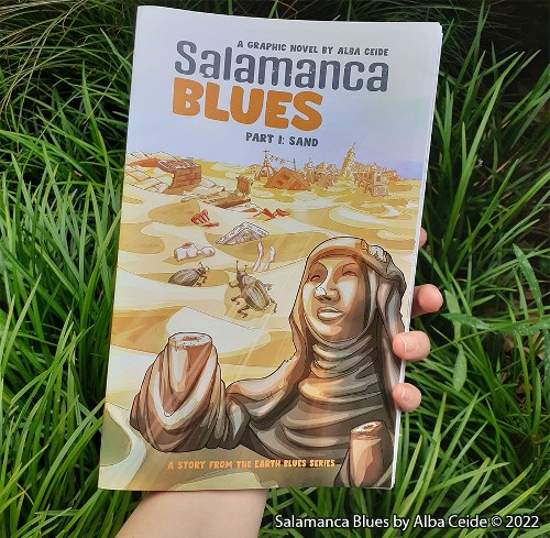
BROKEN FRONTIER AT 20! As part of our 20th birthday celebrations we’ve been running a number of creator pieces from our Broken Frontier ‘Six to Watch‘ artists past and present to give insights into their creative decisions and artistic process. Today at BF we that commentary over to Alba Ceide to talk about her first long-form project, the stunningly cartooned Salamanca Blues. You can read our review of Salamanca Blues here.
Click on images to enlarge
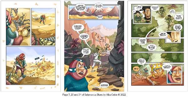
Salamanca Blues is my first long-form graphic novel, a fantasy adventure in a distant post-apocalyptic future when most of Spain has became a desert and mankind is on the brink… The story starts in the ruins of Salamanca where a community of people live controlled by an extremist religious order that promotes superstition and intolerance. I use humour and fantasy to explore how humans would adapt to the new life conditions of our planet after climate change. Salamanca Blues is divided in two parts and I recently self-published the first one, Sand, with a crowdfunder on Indiegogo.
RESEARCH AND CONCEPT ART
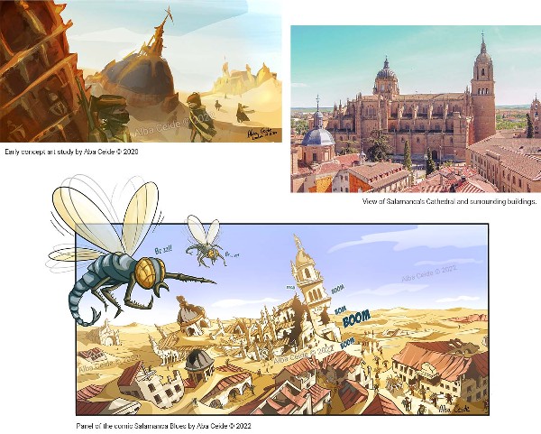
One of the reasons why I chose Salamanca for my comic is because I lived in this city during the first years of my BA studies, it’s an evocative monumental place full of history. I started this project creating the following concept art study of Salamanca’s ruins semi-buried in the desert and I imagined how a society could survive on this environment. I was inspired by the current ecological crisis, a large part of the Spanish territory suffers from desertification and I used exaggeration to magnify and represent this issue with a desert.
ARCHITECTURE
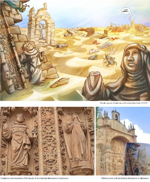
Salamanca, where the story starts, is a monumental city with historical architecture (Romanesque, Gothic, Moorish, Renaissance and Baroque monuments) and a characteristic golden colour palette which is given by the material used in most of the buildings, a freestone called Piedra Franca de Villamayor. Even if I was writing a fictional story, I wanted to be true to the real city and preserve part of its historical buildings. I used a warm colour palette and drew recognizable landmarks like the semi-buried ruins of the following double-spread, inspired by San Esteban Monastery. The two broken sculptures in my comic are inspired by the two sculptures of the facade of the Monastery. I also drew the bell-tower semi-buried in the desert. The real facade has engaged columns full of intricate ornamental designs and I created my own version with humoristic elements.
CREATURES DESIGNS
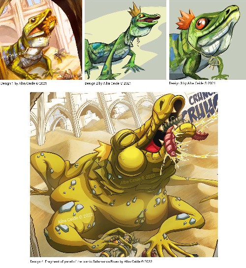
The city of Salamanca is full of stone buildings and in summer it’s easy to spot small lizards on the walls. In my comic Salamanca’s habitants worship a huge lizard. I initially got inspired by the Ocellated Lizard, common in central Spain, but as I advanced working on the personality of the character, I developed further the design because it needed to be huge for people to think that it could be a God! You can see below the evolution of the design: Design 1 was an early realistic approach to explore the shape and textures of a lizard. Design 2 was my first cartoony version, I didn’t want to make a serious comic but this lizard was too skinny to be a God fed by people in a religious ritual… Design 3 was better but it was too friendly. Design 4 is the final design in one of the panels of the comic, it’s a fat and proper huge lizard God.
The insects in the future of my comic are big and I got inspired by the large insects of the Late Carboniferous period, see below the Arthropleura (1) which length could reach 2.5 meters and the Meganeura (2) which wingspan was around 65 cm. My insect designs for the future are heavily inspired by these creatures from the past. I also took inspiration by the Phorusrhacids (3), a large carnivorous flightless bird from the Cenozoic era, to design one of the predators of my comic.
ENVIRONMENT DESIGN
In the first part of my graphic novel, the main characters start a journey from Salamanca (central Spain) to Galicia (in the North), where the second part continues. I was inspired by the road trips between my home-city A Coruña (Galicia) and Salamanca where I studied, which it also coincides with the ancient pilgrim route called La Via de La Plata (St. James’ Way), see the scallop shell on the rocks of the comic page below, symbol of St. James’ Way. Central Spain is a dry steppe, while the North has an intense green and leafy landscape, exaggerating these characteristics and getting inspiration from current ecological catastrophes, I transformed central Spain in a vast desert, while the North… well, wait to see what happens to the North in the second part of my comic 😉 See below how the environment design changes as the story advances, I focused on gradually introducing vegetation as the characters move up the country.
ECOLOGICAL ISSUES
While I was drawing the comic in 2021, the Ricobayo reservoir (Zamora, Spain) was largely drained by the electricity company Iberdrola to take advantage of high energy prices and maximise their profits. In my comic, the main characters would pass walking not far from that area so I drew the ruins of the hydroelectric power station on their way as a reference to this event. In the image below you can see the actual hydroelectric power station in Ricobayo and an image that shows the state of the reservoir after it was drained by Iberdrola (photo from EFE taken from https://www.theguardian.com/world/2021/aug/15/spain-launches-inquiry-after-dams-drained-for-profit-amid-heatwave). In the comic, I drew my own version of the scenario depicting how this place may look in the future… I painted dunes to visually magnify the ecological disasters.
ARTISTIC PROCESS
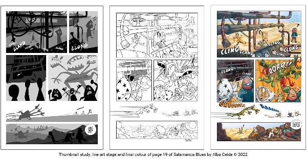
I loved working on this comic, it was a great experience. Apart from all the research I did to design the environments, characters and give consistency to the project, I worked a lot on the composition of each page. The first image below shows the blocking I’ve done on one of the pages: I used simple shapes to distribute elements on the page and to make sure that everything fits. I normally block elements in greyscale and do panel thumbnails of all the pages of the comic before doing any detailed drawing. When I’m happy with the thumbnails, I go into detail drawing the line art as you see in the second image. For this comic I drew in Sketchbook Pro, and then I coloured the pages in Photoshop using flat colours, cell shading and a few light effects.
Visit Alba Ceide’s site and online store here
Top BF logo by Joe Stone


