Our Inside Look feature at Broken Frontier provides creators with the opportunity to share exclusive commentaries on their comics projects with our readers, giving insights into the genesis, process and themes of their work. It’s one of the oldest regular features at BF, first appearing on the site back in the mid-2000s and also one of our most well-received. Today’s commentary on Such, Such Were the Joys comes from Sean Michael Wilson who adapted George Orwell’s autobiographical work in collaboration with Jaime Huxtable. Such, Such Were the Joys is published this month by Pluto Press.
(Click on images below for expanded views)
Sean Michael Wilson is a multi-award-winning comic book writer. He has written over 40 books, including an illustrated Tao Te Ching, and co-authored Many Not the Few, with a foreword by Jeremy Corbyn, and Parecomic, with a foreword by Noam Chomsky.
Jaime Huxtable is a cartoonist and illustrator based in West Sussex. His works include G Bear & Jammo (reviewed on Broken Frontier back in February 2018) and Makers of Monsters (with writer Mark Pembrey).
For Such, Such Were the Joys they bring to vivid graphic life one of George Orwell’s most celebrated essays. Orwell looks back on his childhood and on his experience of boarding school, reflecting on the often brutal realities of the regime to which pupils were subjected in the name of class prejudice, hierarchy and imperial destiny. This ground-breaking graphic treatment conjures up how this harsh world looks through a child’s innocent, accepting eyes while juxtaposing the mature Orwell’s ruminations on what such schooling says about society. The book aims to introduce Orwell’s writing to new readers while offering a fascinating new visual dimension for those who already know it well.
This ‘Inside Look’ focuses on some of the additional material Jaime and I created whilst adapting Orwell’s essay into comic book form. Our book stays pretty close to Orwell’s original, and that is in itself a creative and philosophical choice of interest. Generally I prefer that way of doing things, rather than ‘jazzing’ up something by putting it into a modern setting and having people who are supposed to be in, say, 17th century France, speak like modern day Americans. But, in any visual version of an original text there will be some aspects added and others subtracted. Often that is done for the sake of making something shorter, sometimes to make it longer. In any case there will be some new aspects added for the sake of making it flow as a graphic novel, both in terms of the spacing of text in speech balloons, and the flow of visuals within and across panels.
In the case of our Such, Such Were the Joys graphic novel there are some panels where dialogue has been invented to fit Orwell’s description of a scene but do not specifically note the words. There are also panels where Orwell’s words have been replaced by visuals with fewer words. And some with no words at all.
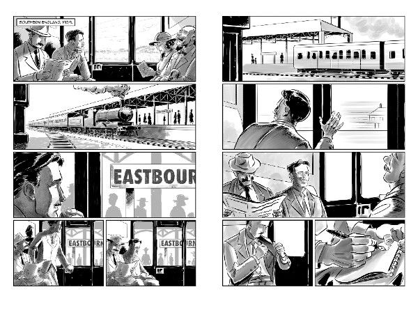
For example, this opening scene in which we see the adult Orwell happening, by chance, to stop at the railway station connected to his old school. We don’t know if such a thing ever happened – but seeing as he travelled around that area sometimes as an adult it’s likely enough to be able to include it. The purpose of this scene is to show Orwell as we all know him – rather than as a child, who would be less recognisable (plus the adult Orwell is not on the book cover either). So showing him here at the start of the book helps set up clearly who this story is about. It also establishes adult Orwell as the narrator. We have the adult Orwell again at the end of the book, to neatly wrap it all up.
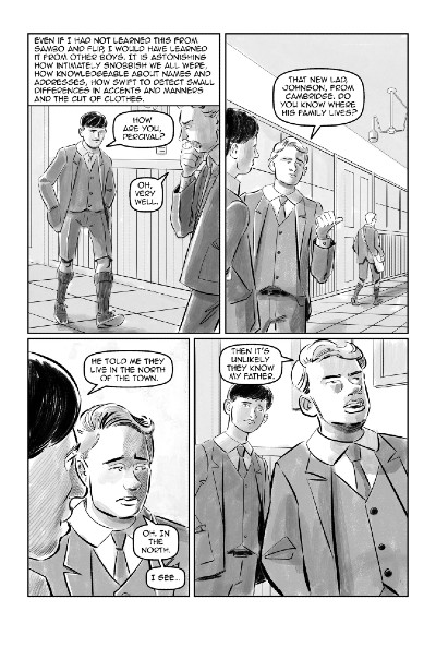 In this scene (page 74) in which the kids are showing off their class, wealth and snobbery, Orwell says that “There never was, I suppose, in the history of the world a time when the sheer vulgar fatness of wealth, without any kind of aristocratic elegance to redeem it, was so obtrusive as in those years before 1914.” And we visualise that in various aspects. But I thought we should also insert an actual conversation to show how this manifests itself in the boys. So this page is almost entirely new.
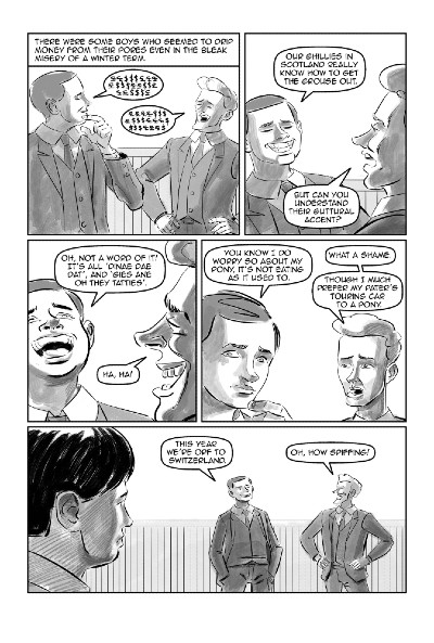 On page 75, Orwell’s original text just says “ the accent of ‘our ghillies “ when the posh southern English kids are discussing how funny and indecipherable the accents of the Scottish people are when they go grouse hunting up there. So, to extend that and bring it to life I added in some realistic Scottish dialogue for them to mimic.
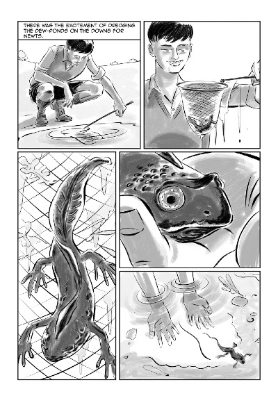
Page 39 is another example. Orwell loved newts and toads and so do I. He mentions catching newts in ponds as being one of the few pleasures he had. So we added a whole page of mostly ‘silent’ visuals about this.
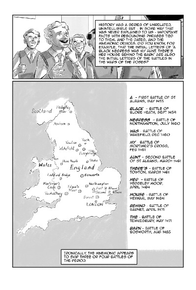
Page 23 is a rather simple but telling instance of how visualising something makes it easier to understand and remember. The rather long mnemonic works for auditory processing, but by adding the visual map of where those places it grows into something more.
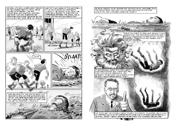
For pages 89-90 we used the comic book technique of having the text and visuals operating in parallel with each other, giving different information rather than describing the same thing; working together as a whole which is greater than each part. As comic book readers we tend to forget how sophisticated the cognitive processes involved in reading/seeing such multi-dimensional pages are. But, they are.
Such, Such Were the Joys is published this month by Pluto Press. Buy online here.


