Resuming the latest mini-season of our ‘Covers Album’ feature, where we ask comics creators, publishers and commentators to pick three of their favourite comic covers… but with a small twist. One must be chosen for aesthetic reasons, one for inspirational reasons and one for pure nostalgia! Today’s guest is Josh Hicks, one of our Broken Frontier ‘Six to Watch‘ artists in 2017, the man behind micropublisher CPE Books and, of course, the creator of the much loved Glorious Wrestling Alliance series which is collected this month in a new colour edition by Lerner/Graphic Universe.
Inspirational choice: Whoa, Nellie! No. 1 (1996) by Jaime Hernandez (Fantagraphics) & Pro Wrestling Superstar Retsuden (1980 – 1983) by Ikki Kajiwara (w) and Kunichika Harada (a) (Shonen Sunday Comics)
This one is a straight tie — all of these cover images were key sources of inspiration when I was making my own wrestling comic, Glorious Wrestling Alliance. The way Jaime Hernandez is able to perfectly capture the nuances of in-ring action was super inspiring — even if there’s hardly any actual wrestling in my own book — and I liked to look at scans of his Whoa, Nellie! covers to remind me a) how to draw wrestling and b) that you don’t need to bother to spend ages drawing crowds. That huge, integrated title lettering is great, too.
The bold and colourful covers from the Pro Wrestling Superstar Retsuden series, on the other hand, were like perfect mood board pieces to put me in the wrestling comic state of mind, kind of informing the world in which I could make my own characters panic and bicker. They inspired me throughout the writing and drawing of my comic, and also inspired me to figure out where to import Japanese comics online, before then inspiring me to get a credit card. Very inspirational.
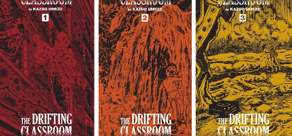
Aesthetic choice: The Drifting Classroom (Originally published 1974; Viz Perfect Edition published 2019) by Kazuo Umezz, designed by Adam Grano
I love reprints of older manga stuff, where the designer is forced by circumstance to only work with what’s actually inside the book for the cover. Usually this means blowing up a panel and building a design around that. Adam Grano has done it beautifully with this three-volume edition of Kazuo Umezz’s wild class trip into hell. The images themselves are striking, the treatment of the text is great and the colours shift from book to book to form a gradient on a bookshelf. Lovely! Looking up older editions of this book really drives home the difference a cover can make to the way you perceive a work — this new treatment really makes The Drifting Classroom look like the classic it most definitely is.
In terms of honourable mentions, there is a lot of great stuff in this vein: Jason Booher and Helen Yentus’s treatment for Seiichi Hayashi’s Golden Pollen and Other Stories (PictureBox, now defunct) is beautiful, as is Jessi Rymil’s cover for Yuichi Yokoyama’s World Map Room (also by PictureBox). All of the Breakdown Press manga reprints have amazing covers, too. I wish I could design like these people.
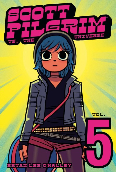
Nostalgic choice: Scott PIlgrim vs. The Universe Vol. 5 (2009) by Bryan Lee O’Malley (Oni Press)
You can’t tell over the internet, but the greeny yellow bit of this cover is metallic and shiny. I was too young to have witnessed the holofoil boom in comics in the 90s, so when this was announced as the cover of the fifth Scott Pilgrim book in 2009, it blew my mind. I’m very easily pleased, obviously. This probably birthed my love for cover gimmicks, from the acetate slip on Adrian Tomine’s Killing and Dying to the little window cut-out in the front of Connor Willumsen’s Anti-Gone. Bryan Lee O’Malley’s books made a big impact on me as a teen, and will always hold a place in my heart for helping me get back into Western comics after years of exclusively reading illicitly sourced scans of Naruto. This cover especially is also inspiring in that it proves you can make a great cover with just one figure and a bit of good design work.
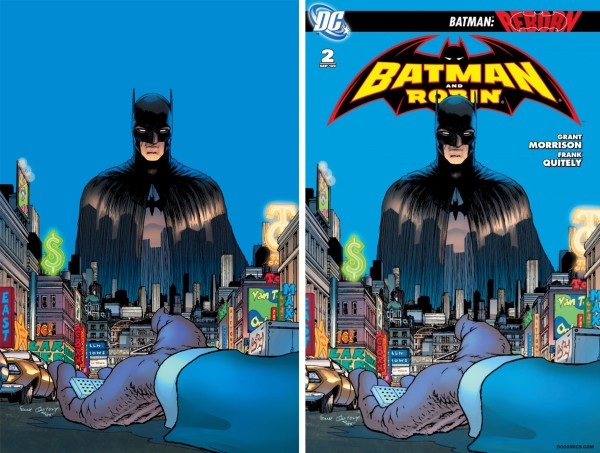
Honourable mention for this round goes to Frank Quitely’s cover for issue #2 of Grant Morrsion’s Batman and Robin run (Quitely also did the interiors). Again, very influential in terms of me returning to a certain kind of Western comic. The figure, composition and colours here make Batman look relevant and cool in a way I don’t really think I’ve seen before or since. The only reason this one is an honourable mention is because the actual printed version is slightly marred by all the bumf DC stuck at the top.
Read the full ‘Covers Album’ back catalogue here. If you’re a comics creator, organiser, commentator or publisher and you’d like to take part in Covers Album contact us by e-mail here.


