 In ‘Covers Album’ each Wednesday we ask comics creators, publishers and commentators to pick three of their favourite comic covers …but with a small twist. One must be chosen for aesthetic reasons, one for inspirational reasons and one for pure nostalgia!
This week it’s the turn of our very own BF team member Jenny Robins to give us her selections. Outside of her esteemed efforts her at Broken Frontier reviewing and interviewing for the site Jenny is also a comics creator. Her short strips have been published in Solipsistic Pop, Meanwhile…, Over the Line and Dirty Rotten Comics.
She’s also a self-publisher whose zines have included What Birds Are Really Thinking #1-2 and Real TV Wisdom#1-2. You can find more examples of her work on her site here. Jenny is also currently working on a book of short comic stories based around her illustration project #3point52billion.
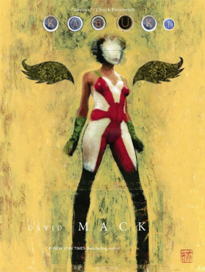
Aesthetic Choice: Kabuki Library Volume 1 (2015) by David Mack (Dark Horse)
Can I boringly preface this with saying choosing three covers to sum up your relationship to comics is really hard? I mean obviously, but still, it’s really hard. David Mack had to be in there for me though, his juicy fluid linework combined with fearless use of multimedia and experimental page layouts stole my heart a long time ago, he is a genius at balancing the simple with the complex.
Although this is a relatively recent cover, it is a new artwork to represent an old storyline, being the cover for a new edition of the first stories. Since her origins Kabuki has travelled a long way in terms of location, genre and style, while the titular character was shown from many perspectives from the beginning of the series, her crime fighting persona was furthest to the front of the narrative in the early stories.
Here she is standing clear and central in her rising sun flag body suit, the stance says loud and proud superhero, but the scritchy brushwork over the face obscures her mask (taking the metaphor a step further even than covering her face does already) and the legs become inhuman and strange in their lower halves, slightly cartoonish, slightly animalistic. The framing and use of gold are reminiscent of medieval altar pieces, as is the pattern on the collaged wings. Nothing on this cover is flat colour, and yet it is the very essence of graphic, and in your face subtlety. The hints of so many of the elements of the story are there, and yet it remains such a simple and strong image.
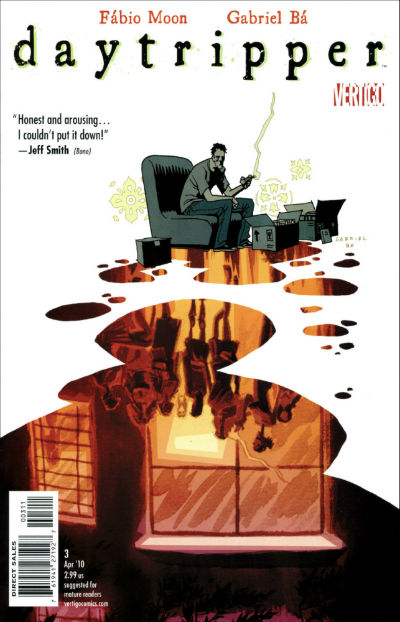
Inspirational Choice: Daytripper #3 (2010) by Fábio Moon and Gabriel Bá (DC Comics/Vertigo)
After a lot of angst, I managed to resist picking a Love and Rockets cover for ‘Inspirational’, but because I just have to be same same but different I’ve plumped for another fraternal duo, these two being from Brazil, not Mexico. I read Daytripper in the TPB, but this cover is my favourite, partly because it flips on its head the visuals of the first cover of the series which also featured on the front of the compilation.
In #1 we see Bras sitting on a bench looking upwards from the bottom of the cover, with a splash of inky rainbow thoughts and memories travelling up behind him like a plume of smoke. Here in #3 the tables are turned and Bras is sitting at the top of the page, skull-like shadows over his downturned face, while an inky puddle reflects his life back up at him. A theme is emerging here with the combination of graphic line and painterly elements. That might be my favourite thing. Argh the cleanness of the edges of the puddle shape are just so nice with the organic wet on wet textures and the richness of the colours though!
I also like how the figures in the reflection are kind of elongated like a late in the day shadow, and the only one whose feet we can see seems to be kind of floating, this adds to the unreal feeling of the reflected scene. Also the detail of the little “this way up” arrows on the packing boxes, somehow add that finishing touch the visceral loneliness of the figure in shades of grey. There’s still something about the image that keeps that tragic characterisation tongue-in-cheek and I get a feel that Bras’ angst is somewhat self-indulgent. I might just be remembering that from the story, but maybe it’s the amber (nectar) colour of the puddle and that sense of unreality that permeates the scene that implies his imaginings and memories are slightly untrustworthy.
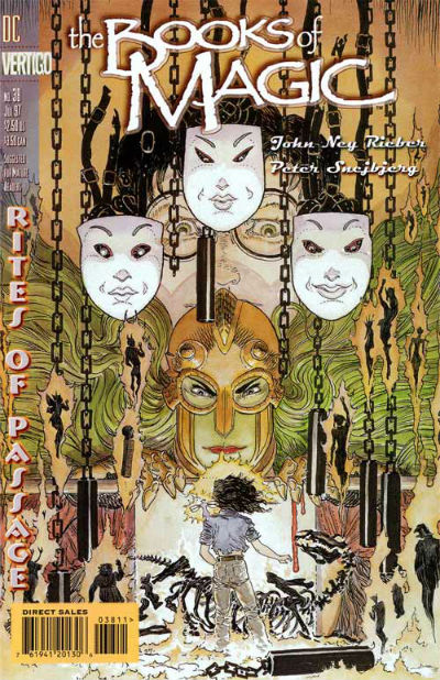
Nostalgic Choice: The Books of Magic #3 (1997) by Mike Kaluta (DC Comics/Vertigo)
Look out Molly! A skellington horse! Again I read The Books of Magic in paperback form first, thought I started buying issues from the long boxes in Dave’s Comics in Brighton once I had read all of the ones that West Sussex Libraries had in stock. I came at comics in my mid-teens from a bunch of directions at once, from American cartoons yes; from Anime yes; from my parents’ Asterix books too, but that one shelf of graphic novels in my local library was super crucial to my mishmash graphic education.
Books of Magic was my gateway drug into a Vertigo obsession and reading a lot of books that really weren’t very age appropriate. We took two books of magic (laminated) library paperbacks with us on a family holiday to France and me and my sister spent half the fortnight copying Peter Snejbjerg’s art. Molly’s hair still haunts me. I have waited my whole life to draw someone with Molly’s hair and I finally have done so with my character Maya in my current project.
Molly always interested me more than Tim, I guess you could call her the Ginny to Tim’s Harry, if you were bothered about similarities between bespectacled boy wizards. Molly is way angrier though. I still read comics out of the library. You should too. Whilst also supporting your local comic book shop and grassroots creators, obviously.
For more on the work of Jenny Robins visit her site here and follow her on Twitter here.
Read the full ‘Covers Album’ back catalogue here. If you’re a comics creator or publisher and you’d like to take part in Covers Album contact Andy Oliver by e-mail through the address provided here.


