 It was a pleasure to see Katriona Chapman’s profile rise as significantly and deservedly as it did in 2015. Her self-published autobiographical series Katzine gained widespread critical acclaim, and her place as an integral part of the Avery Hill Publishing team was firmly established. Indeed, Katzine was one of my annual ‘Ten UK Small Press Comics You Need to Own!‘ for 2015, with its gorgeous shaded artwork and Chapman’s affable rapport with her audience getting a special mention.
With an accessible slice-of-life appeal and a recurring focus on the natural world, Chapman’s work has been featuring in ‘Small Pressganged’ since I reviewed her beautifully tactile Brockley Foxtrot in 2012 here. In our latest ‘Small Press Inside Look‘ feature – wherein artists talk about their work and creative process – Katriona looks back at some her earliest comics and also provides an in-depth commentary on the world of Katzine…
Click on images to enlarge.
Lost
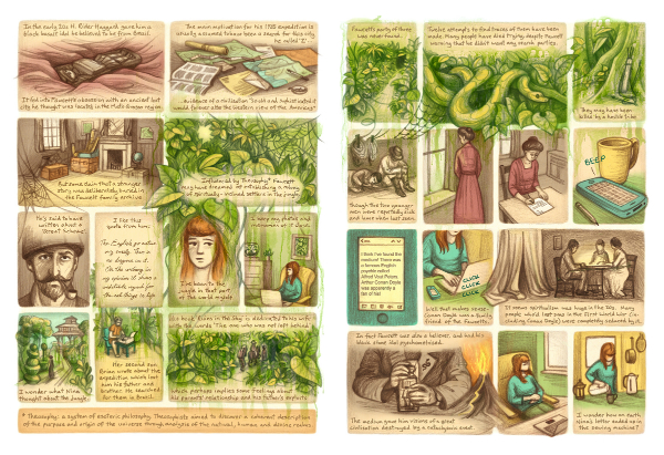 These pages are in order of when I made them! This first spread was one of my first comics… a five-page story about an old letter a friend and I found and our efforts to discover its origin. We ended up doing a lot of research into the extraordinary backstory of this letter, and there were various twists and turns in our process of investigating so it was tricky to decide what to include in the comic. The comic ‘Lost’ mixes scenes from the past with scenes of us researching in the present.
The story ended up being about an explorer who was somewhat obsessed with the Amazon and went missing in Brazil in the twenties. Another of the characters calls the jungle the ‘green hell,’ and I wanted the jungle to be a character in its own right and kind of spread and drip out of its panels. I hoped this would also suggest the way in which it impacted/seeped into all the characters’ lives.
I used scanned ink drips to suggest the atmosphere of the rainforest and also maybe imply a sinister quality. As the process of our research had felt like teasing out a web of connections and trying to make sense of them, I also included images like vines, threads, spider’s webs and ropes. The colour scheme was inspired by a photo I came across of an old page from an Atlas, as maps were another recurring visual motif.

(Full comic can be read at www.katrionachapman.com/lost)
Katzine: ‘It Moved so Fast’
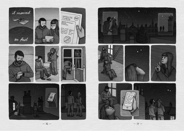 The second spread is from the first issue of my ongoing comics project Katzine. I know I have a tendency to want to cram in a lot of information into my comics sometimes. I also felt like ‘Lost’ probably had too many words in it, so I wanted to do a wordless story for Katzine. ‘It Moved So Fast’ is a simple two-page story about watching the International Space Station move through the sky.
I knew the rooftops where I live and night sky would be the stars of this story visually, and that light and dark would be important to the atmosphere. The stars and light spilling out of the windows help to convey the feeling you get when you stand in the cold night air and look at the stars and think about how small you are. The comic is drawn in pencil and I added digital tones, gradients and textures to build up the tonal contrasts I wanted.
Katzine: ‘The Banana Skin’
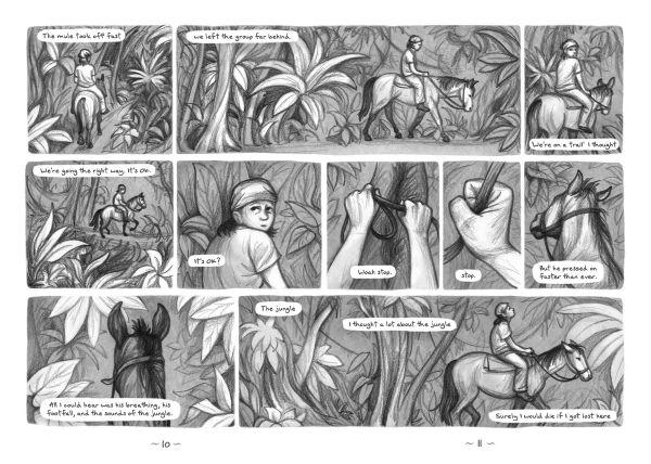 The third spread is from ‘The Banana Skin’ in issue two of Katzine, and it’s a return to my favourite subject of the jungle. I’d wanted to do a comic for a while where the panels spread across the full double-page spread instead of just individual pages. I thought this would suit a travel story well, as I thought I could give the whole story a strong left-to-right feeling of movement. There were parts of the story that also dealt with how people change over time and I thought the left-to-right dynamic would also fit with that sense of time passing.
This comic was also part of my continuing efforts to draw faster and looser. The digital stage of this was also faster as I only added a background texture and some highlights. When I draw my figures quickly I like that the drawings can be more gestural and expressive of the character’s state of mind than if I spend too much time polishing the drawings up.
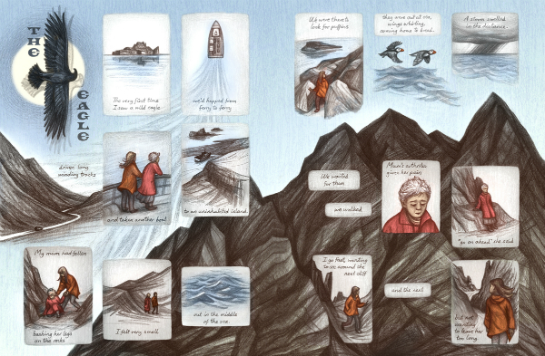
Katzine: The Eagle
The fourth spread is from a story called ‘The Eagle’ which I drew early last year but only appeared in the most recent issue of Katzine. With this comic I wanted to experiment with the overall page design more… with having background illustrations behind the panels and making the panels less regular. I wanted to create a sense of movement across the whole spread and play with how to lead the reader’s eye. Like the last one, this story again dealt with the sense of feeling small in the face of natural forces. It also touched on themes of frailty and death so I wanted it to have a darker edge. The drawings are more angular and stark.
Katzine #4
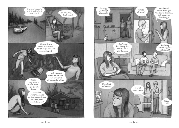 The fifth spread is from an issue of Katzine where I used all 24 pages to tell the story of a trip I took last year to Iceland, Canada and New York. There was a lot to do with memory and the feelings involved with returning to a place that means a lot to you after a long time away. I wanted to experiment with less realistic ways of expressing these feelings hence the image of my character floating above the house. I wanted to suggest the sensation of finally being able to reconnect with the childhood sensory memories I had of that house and its surroundings.
In this comic I set myself the task of working with only dialogue and interior monologue. In previous travel diaries I felt I had relied too much on narrating facts about the journey in captions. In terms of visual style I also tried using just lines to separate panels rather than white space. I liked how this looked and how it made me feel like I could play with placement of speech bubbles more.
Katzine: ‘Highlands and Islands’
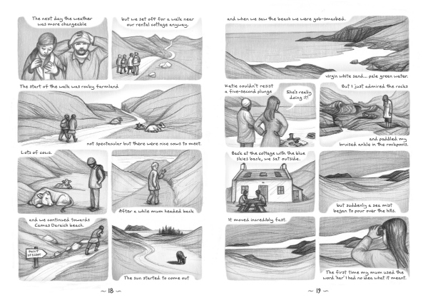 The sixth spread is quite landscape-heavy again! I think the thing that interests me most is the relationship between people and places and I guess that comes into all of these comics to some degree. This comic ‘Highlands and Islands’ is a straightforward holiday diary depicting a trip to Skye. Again it’s an exercise in working fast adding just a grey background texture and highlights to create tonal variation.
I’ve really enjoyed using comic experiments in Katzine to see how minimally I can use lines and tones to try to show the visual essence of a place. Sometimes with Katzine I find it a shame that I’m limited to black and white, as much as I like working in black and white. I’ve now started work on a graphic novel project that has a travel theme, and I’m looking forward to using everything I’ve learned through drawing Katzine but also being able to use colour more.
I have a newsletter where you can get news about new issues of Katzine and my graphic novel progress! Sign up on my website (top right-hand corner of the homepage.)
For more on Katriona Chapman’s work visit her site here and follow her on Twitter here. You can visit her online store here to buy her books including Katzine.
For regular updates on all things small press follow Andy Oliver on Twitter here.








[…] Now Katriona Chapman walks Broken Frontier through her KATZINE processes – and earlier work – re… […]
[…] Now Katriona Chapman walks Broken Frontier through her KATZINE processes – and earlier work – re… […]