 In ‘Covers Album’ each Wednesday we ask comics creators, publishers and commentators to pick three of their favourite comic covers …but with a small twist. One must be chosen for aesthetic reasons, one for inspirational reasons and one for pure nostalgia!
This week we turn to Paddy Johnston, co-publisher of Good Comics, the UK micropublishers behind the popular anthology comics zine Dead Singers Society, Robin William Scott’s Every Life I Ever Lived and Broken Frontier 2016 Breakout Talent Award winner Rozi Hathaway’s Cosmos & Other Stories. He’s also a creator himself having produced comics like Long Divisions and Ballgame.
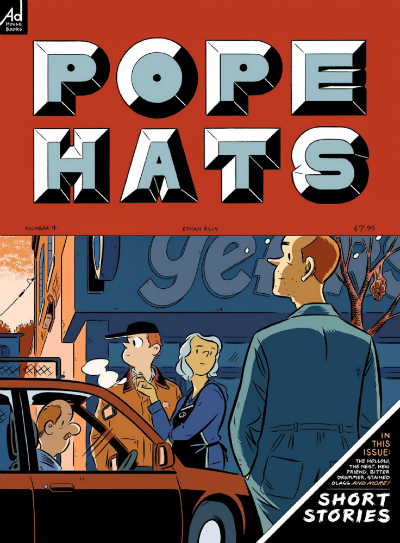
Aesthetic Choice: Pope Hats #4 (2015) by Ethan Rilly (Adhouse Books)
I’ve loved Ethan Rilly’s work for some years, and he’s someone I think is criminally underrated. Maybe it’s because he keeps a relatively low profile and seems to just publish comics whenever the hell he wants to, which is an attitude I really admire. The covers of his Pope Hats comics just keep getting better, and the latest one is really something. It’s quite a big and wide format, which allows the really cool industrial block lettering to stand out against the deep red on the top third. But I think it’s the composition of the people in the image that really works – they’re arranged to come at you slowly, and stories seem to emerge from the cover the longer you look at it. It’s subtle, and doesn’t hit you all at once. At the same time, it does have a really classic, timeless and almost pulpy feel. It’s just great.
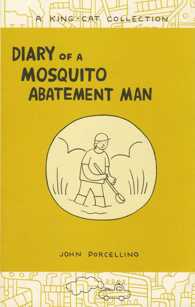
Inspirational Choice: Diary of a Mosquito Abatement Man (2005) by John Porcellino (La Mano)

John Porcellino’s work in general has been a huge influence on me and my own cartooning, which I try make expressive, unpretentious, not overthought, and honest in the same way that John’s is. The covers of his books (often collecting his King-Cat zines) are often very simple in the way that his linework is, but this one goes a little further in a way that I really like. It’s still very simple, centered around the one main image and thrust of the story, and makes good use of borders and backgrounds and singular colours and other simple features that can bring less intricate cartooning to life. I tried to do a similar thing with my most recent comic, Ballgame #1.
Nostalgic Choice: Scott Pilgrim’s Precious Little Life (2004) by Bryan Lee O’Malley (Oni Press)
Some will think it’s a little early to be nostalgic about Scott Pilgrim, but the first black and white book is particular to a nostalgic place and time for me. Specifically, when I was getting back into comics and graphic novels as an undergraduate student, I picked this one up in a tiny comic shop in Exeter after seeing it in the window. Its slightly ugly orange background and manga-leaning character style grabbed me instantly, and the title led me to assume that it would be a book about a charming slacker (just like I thought I was at the time). When it turned out it was, I knew I’d found my new favourite comics series, and I was also inspired to have a go at cartooning myself.
Honourable Mention: Human Garbage (2017) by Josh Hicks (Good Comics)
This might seem like just a shameless plug for the next Good Comics publication, but I really do absolutely love everything about this cover, and when Josh sent it in to us we were bowled over by it. Most significantly, it plays on the title of the collection with wry humour and ties in to the title and overall aesthetic of the book really well. Covers can often be a bit removed from the content of the comic itself as their aim is to stand out on a shelf, but this one is the perfect encapsulation of Josh’s wit and his skill with linework and flat colours, and the ideal introduction to his style.
For more on Good Comics follow them on Twitter here and visit their online store here. You can pre-order Josh Hicks’s Human Garbage here.


