This month at Process we had Andy Poyiadgi talk about why and how his work was put in a tea room in Kendal, Lorenzo Fiorini shared some tips on comics composition that he got from Eduardo Risso and Richy K. Chandler gave us a live demonstration of his watercolour technique.
Process is a comics workshop and discussion group that meets up on the first Wednesday of every month at Gosh! Comics from 7-9 pm. The idea is to have a place where creators and readers can get together and discuss the mechanics of comics, present work in progress and find new collaborators. Each meeting opens with everyone introducing themselves, continues with some more general chat and finishes up with half an hour or so at the end for everyone to mingle and discuss things less formally.
 We started off with our traditional introductions and welcomed some new people to the group. There were a couple of projects that people were involved in that they were looking for a bit of help with and wanted to let the group know about.
Daniel Baldwin is putting together a documentary about the UK Small Press scene and was looking for backers for his Kickstarter. The chances are the campaign will be over by the time you read this but do have a look at the project. It looks amazing and he’ll need people to go see it once it’s finished so you can still get involved.
Matthew Duncan is looking to put together an anthology for the 100th anniversary of the start of World War One next year and is looking for contributions. Strips should be no more than 6 pages long and you can get in touch with Matthew via the Process page on Facebook where he has also posted his request for material.
The presentations then began with Andy Poyiadgi (interviewed in Broken Frontier’s ‘Small Pressganged’ column here recently) telling us about his involvement in the recent Lakes Comic Art Festival in Kendal.
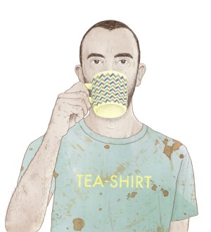
Andy began with an overview of his comics work up to this point, which went some way to explaining his specific involvement in the festival. A few years back Andy entered, and was shortlisted for, the Observer/Jonathan Cape/Comica Graphic Short Story Prize with Teapot Therapy a brilliant strip about loneliness and the ritual of tea-making.
In a moment of fantastic inspiration Andy chose to colour his strip with tea, a move which added tone and texture to the piece while also adding to the thematic resonance. He has produced the strip as a fold-out, single sheet comic and it looks glorious. Andy went on to supply a strip for ink+PAPER, David O’Connell’s excellent anthology and found himself involved in Score And Script, John Miers’s experimental project on the mechanics of comics.
 Shortly after this Andy visited the Angouleme Festival in France, a mammoth celebration of comics as a medium that takes over an entire town. While there Andy met Julie Tait, an arts administrator from The Lake District who had plans for an Angouleme-style festival back in the UK. Comics creator/cheerleader/enthusiast (and all-around good guy) Mike Medaglia made a point of letting Julie know about Andy’s tea-related adventures and suggested him as a perfect fit for any such show.
Back in the UK Andy got to work on his latest comic and went back to his greatest inspiration: Tea. Teabag Theories are minicomics that examine scientific theory through tea and actually come packed as teabags. Volume 1 is titled Gravitea while Volume 2 deals with the origin of life and is called The Primordial Brew.
Andy just about had time to squeeze in making a beautiful and technically marvelous origami stripsheet for Mike’s Wu Wei anthology before he got a call from Julie at the Lakes Festival asking him if he’d like to exhibit his work in Farrer’s Tea Room for the duration of the Festival. Enormously flattered, Andy accepted and received the dimensions of the walls of the Tea Room to give him an idea on the amount of space he’d have to exhibit in.
This proved a tougher task than you may imagine. A Tea Room is not a natural Gallery space and wall space may not actually enjoy the line of sight that you may imagine. Andy did the best he could and sent the work off to be framed and hung by the Festival organisers. In honour of the Festival and the area around it Andy produced a new teabag comic on the secret origin of Kendal Mint Cake.
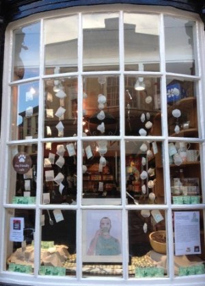
While at the Festival Andy paid a visit to Farrer’s and would be very pleased with how it all turned out. As well as the pieces exhibited on the walls he found a wonderful display of his work hanging in the window (as well as a self-portrait whose prominence he found a bit embarrassing!)
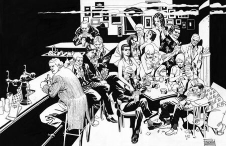 Next up Lorenzo Fiorini shared with the group some tips on the mechanics of comics that Eduardo Risso shared with him while visiting London earlier in the year.
The emphasis of the advice was on storytelling and composition and the various methods Risso uses to clarify story while amplifying effect. He begins by stating that the role of the artist is to tell the story visually so that the reader can understand shifts in narrative and tone without having to rely on caption boxes and dialogue.
The most effective way to do this is in the least amount of panels possible, increasing the intensity of the narrative by grouping the panels in such a way that their very positioning helps the story to flow. Similarly, movement and action within the panels as well as across them can help the eye to move in such a way that the story streams in a natural manner using the visuals alone.
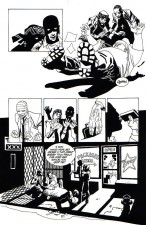 To do this, artists need to be aware of the framing of the images themselves as well as the visual angle that the picture is being presented. This is particularly important in terms of scenes of prolonged dialogue where it can be easy for the reader to be bored by repetitious images of the same characters.
Wider frames and angles are useful for establishing a place or scenario where the landscape is more important than the characters. Risso calls this the ‘wide overall plane’. What he describes as the ‘overall plane’ is a tighter shot, still in wide angle but closer to the characters and the action.
The ‘middle plane’ shows the characters from the waist up and allows you to make out facial impressions while the ‘foreground’ is a headshot that allows you to highlight features and elements to emphasise expressions on the characters face. Finally the ‘extra close foreground’ sees you focus on one element or feature to accentuate its meaning.
Another important element is pacing, whether you are deciding on the amount of space you are giving to a scene or the amount of time that is passing across a series of panels. In terms of composition here Risso advises that it has to strike a balance between unity and variety. If a page is not visually unified it is chaotic, if it’s too visually unified it’s dull. Conversely, if a page doesn’t offer visual variety it’s boring but too much visual variety is confusing.
Some of the methods Risso uses to control unity and variety while keeping a handle on the pacing of the strip are:
- Grouping and Overlapping panels.
- Symmetrical and Asymmetrical images.
- Geometrical layouts.
- Manipulation of contrast and lighting.
Grouping and overlapping panels involves the placing and spacing of panels on the page for effect.Larger panels, spaced apart tend to slow the reader down which can be a problem or an effective method depending on what you need at that point of the story.
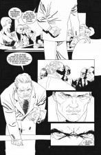 Smaller panels, placed close together will move the readers eye across the page quicker which may be useful for picking up the pace of a sequence. Of course, smaller panels may lack the dynamism or impact of larger panels in an action sequence but by having those panels grouped closer together, or even overlapping, you can quicken the pace while retaining the energy of a larger image.
Risso suggests that symmetrical images are more effective in sequences that don’t involve movement or action and can heighten moments of drama or the climax of a particular sequence while asymmetrical images help to add to the visual energy of an image or sequence and are particularly useful in action scenes. Similarly, geometrical layouts are often used in fine arts, particularly in classical painting, and can be used to heighten effect in particular panels or sequences.
The use of contrast and lighting is something that Risso is particularly renowned for and is especially effective in Noirish work such as 100 Bullets. When using contrast Risso warns about being aware of ‘mass balance’, that is ensuring that large areas of black are matched against similar sized areas of white unless you are going for a specific effect.
A method that Risso uses to get around problems of mass balance is by utilising negative effects, that is to inverse the blacks and whites in a particular section to give a greater balance to the image, sequence or page. One way to do this is through lighting and the manipulation of lighting for effect is another common method used by Risso. He admits to using light ‘freely’ and ‘artificially’ in his work to get the effects he wants.
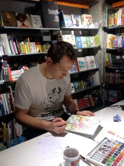 Finally we were lucky enough to have Richy K. Chandler (also recently interviewed at BF here) demonstrate his watercolour method live in the shop. This was inspired by a recent blog that Richy did about producing watercolour pieces that was packed with useful information. (Pictured right, image by Francesca Dare via Richy’s Tempo Lush blog).
Richy had prepared the picture that he was going to colour beforehand – an image of an otter and woman sitting on a branch – and so began his demonstration by explaining the various items he required to begin. He had his paints and brushes, a couple of mugs of water, some tissues, a colour guide to the paintbox (that he’d prepared that day!) and a hairdryer to speed up the drying of layers.
Richy explained that watercolour is effective by layering paint on the page. This can be the same colour layered over itself to make it darker, different colours layered over one another for effect or colours mixed while wet to change colour or texture on the page.
He began working on the piece by mapping out the basic colours that would be required for each section of the page. In watercolour you work from light to dark so the initial layers are very light colours placed in very simple blocks. Over this you can then start to look at texture, shadow and tone by laying other colours or multiple layers to give the picture depth and richness.
Other Processors such as Francesca Dare, Maartje Schalkx and Rosie Polet offered their own advice on materials and techniques and a good time was had by all.
For Richy’s take on the evening click here.
Personally, I’ve never had more fun watching paint dry…
You can follow the Process group here on Twitter. Check out the Process group’s blog here. And you can visit the Gosh! Comics website here.



[…] exhibition at The Lakes International Comic Art Festival. A write-up of the event can be found here, including Lorenzo Fiorini’s tips from the great Eduardo Risso and a watercolour […]