Debuting at Thought Bubble!
Steven Tillotson’s Untitled Ape’s Epic Adventure is, without a doubt, one of the books I’ve been most eagerly anticipating this year. Tillotson was an Observer/Jonathan Cape/Comica Graphic Short Story Competition runner-up a few years back, the man behind the fondly remembered Banal Pig comics, and one half of the team on the brilliantly satirical Manly Boys and Comely Girls Annuals alongside his Banal Pig collaborator Gareth Brookes.
Avery Hill Publishing continue their excellent output in 2016 with the release of Untitled Ape’s Epic Adventure at Thought Bubble in Leeds over the first weekend of November. The book’s premise is described by AHP in the following terms:
On this particular morning in this particular place, Untitled Ape (a giant purple ghost-beast) has decided he needs to see his family. His friend Cat (a cat) doesn’t think it’s a particularly good idea, but at this very moment a massive storm rolls in, and their epic adventure begins.
Without a map or much of a plan, they journey through flooded cities and stormy seas, across frozen plains and snowy mountains, and even up into the world of the clouds on their quest to find Ape’s home in the jungle. Along the way they make the acquaintance of a cast of incredible characters, who both help and hinder them to equal degree. Meanwhile and elsewhere, Ape’s past is starting to catch up with him, and it becomes more and more difficult to keep his dark history from Cat…
What happened to Ape? Why doesn’t he have a name? And can he resist the pressure to return to his old life and make sure his friends and family are safe?
In today’s latest offering in our semi-regular ‘Small Press Inside Look‘ series of creators’ commentaries, Steven Tillotson talks below about his creative process on Untitled Ape’s Epic Adventure, his design decisions and the comic’s origins…
Cover
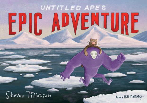
The cover is based on an extension of a scene from the book where the two main characters Untitled Ape and Cat are travelling across an ice floe as it’s breaking up. I took inspiration for the look of the cover from the old Asterix books that were painted in gouache (I think), and wanted to give it a different look to the interior pages. I was thinking about doing an actual painting for the cover, but to give myself a bit more flexibility with the composition, I used Photoshop in a painterly way to try and get that gouache effect. I started with a line drawing on paper first, and layered over the top of it using a stipple effect brush to give it a nice bit of painty texture. There were loads of layers so I could move the icebergs, sea, text and characters about and get the layout right.
I was also thinking of old movie posters for the way the font is shaped around the mountains, and even though the title is a bit tongue-in-cheek, I wanted it to be quite bold and exciting-looking.
The text was originally a mixture of hand-drawn and computer-generated, but in the end it seemed that all hand-drawn fonts looked the best.
I’m really happy with how it turned out, it’s a slightly different technique to what I’m used to but I think it’s pretty bold and invokes those old timey adventure stories, only with a purple ghost-thing as the hero.
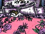
Aerial view panel
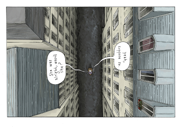
This is a full page image and is probably the most unusual composition in the book. I’m always looking to mix the viewpoints up to keep it interesting for the reader, but also for myself if I’m drawing the same view multiple times. It seemed appropriate to make the speech bubbles fit the perspective so they are perpendicular to the action – this means you can read it any way up if you like. For the reference, I used Google to get views of these types of Parisian apartments from street-level and above.
This and the rest of the book is line drawing coloured on Photoshop with semi-transparent layers of colour, to give a watercolour look. It’s pretty labour intensive, like doing a little painting for each panel, and after 100-odd pages I’m ready to try a different style (i.e. one that doesn’t take AGES).
Hell
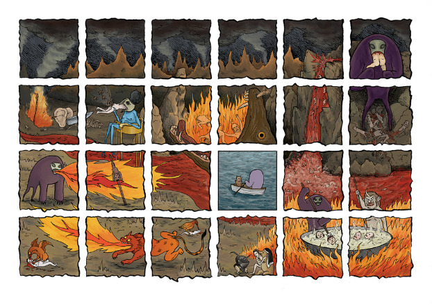
This page is a flashback to hell, and is a montage of different memories of Untitled Ape’s activities there. This takes place early in chapter two, and it’s the first major hint that the mild-mannered Ape has a lot more going on in his past than we, and his pal Cat, know about.
I used a number of references for this, including most prominently Breughel’s ‘The Garden of Earthly Delights’, but there’s also lots of other images of hell from other eras and cultures mangled into it. One of the major things I picked out of Breughel’s painting is the weird bird-headed man with a cooking pot on its head who I liked and eventually ended up as the main antagonist of the story. The nun-pig and the ears and knife are also from Breughel. The scale is a bit all over the place here, but that’s ok because it’s Ape’s memory and not my drawing that’s at fault >coff<.
Over the course of the book there are various flashbacks so we eventually piece together Ape’s journey from his previous life, to being a hell-beast, to being the weird, purple, quasi-magical creature of the present day.
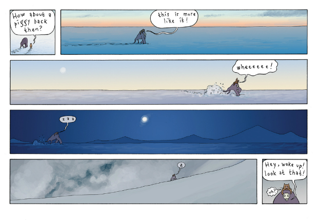
Long panels
The book is landscape in format, and all the pages are either 1, 3, 4, 6 or 24 panels in the same sort of grid (I even redrew one of the early pages because it had 8 panels), but this is a twist on the 6-panel grid that I used a few times. There’s two mini panels that bookend the page, but I wanted to exploit the width of the landscape format page and give the feeling of distance being travelled through the long thin panels, and I think it’s effective in giving a sense of transition. The nice sky colours also represent the time passing.
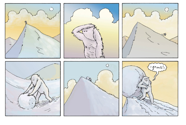
Yeti
The book also features a few side stories from the characters that Ape and Cat encounter, and here we see the Yeti (whose cave they stay in) going about his business. This is the same Yeti from my I, Yeti story which came runner-up in the Observer/Jonathan Cape Graphic Short Story Prize in 2012 and even though that came first I’d already designed him to go in this book, and there’s a little nod to that story as we see the huge mural inside his cave which features in the final page of I, Yeti.
There’s quite distinct colour palettes for different sequences within the story and the pastel purples, yellows and blues are designed to invoke a moody evening as the sun goes down, and while there’s a bit of mystery to this page it sets up a punchline to end this scene (and the end of chapter 3).
I’ve been working on this story on and off since Jan 2011 (it was originally conceived as a webcomic) so I’m delighted to finally get it finished and out in the world. I think the book’s going to look great and I’m excited to see what people think…
For more on the work of Steven Tillotson visit his site here and follow him on Twitter here. You can pre-order Untitled Ape’s Epic Adventure from Avery Hill Publishing’s online store here priced £12.99. It launches at Thought Bubble in November.
For regular updates on all things small press follow Andy Oliver on Twitter here.


